Kuhoo brand identity
Design Challenge
Kuhoo is a student loan fintech platform that aims to make educational loans accessible and affordable, especially for the middle-class and lower middle-class students in India. The challenge was to create a fresh and relevant brand identity for Kuhoo that stands out in the fintech space.
Solution
Kuhoo is the Sound of Opportunity for anyone beginning their education and career journeys. With fine-tuned processes and technology, they make the process of getting a loan more accessible thus making higher education more accessible. Education changes lives and Kuhoo aims to have a big impact on the student’s family and thereby the society at large.
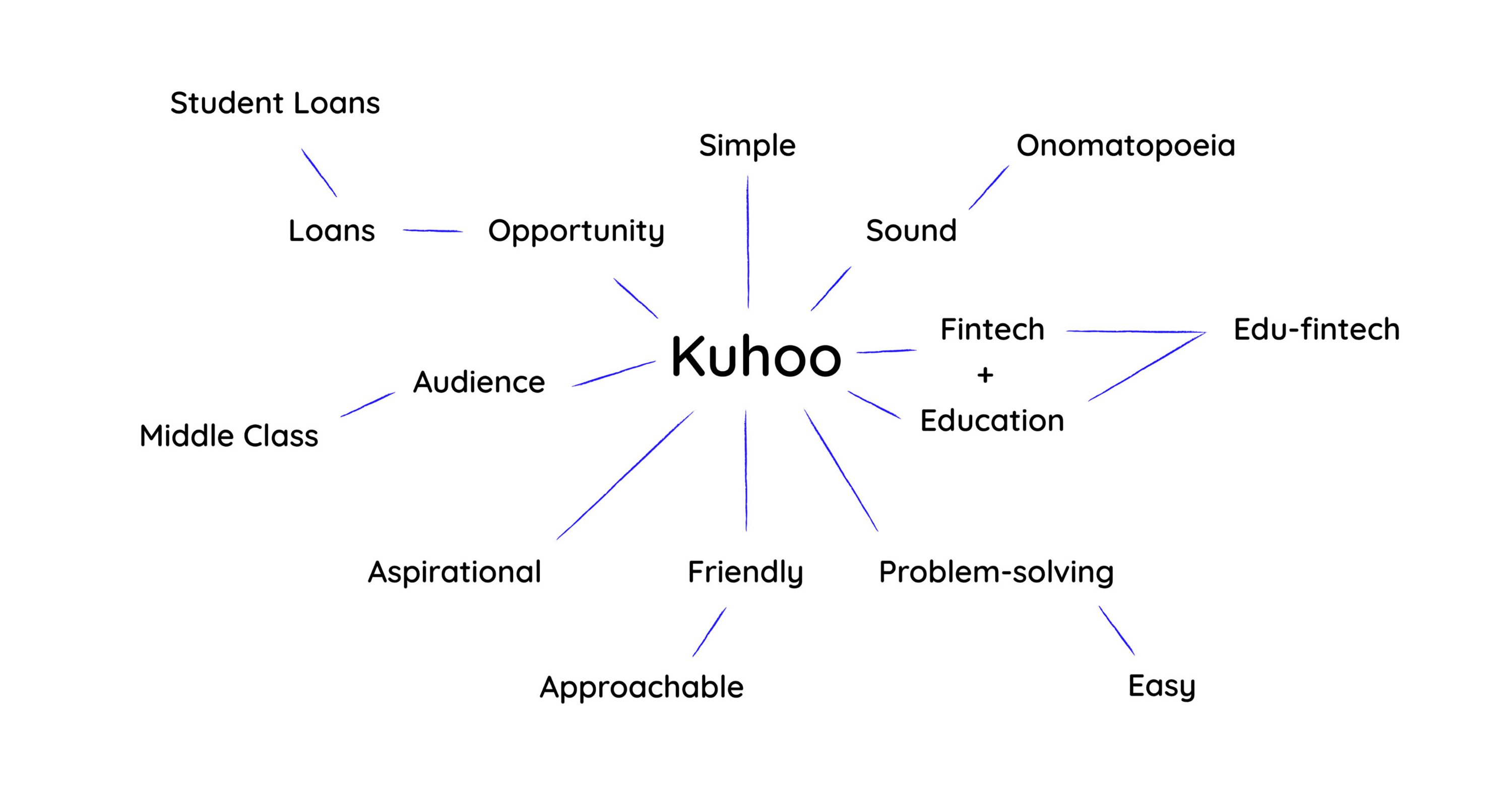
The word ‘Kuhoo’ is an onomatopoeia - it’s the sound a Cuckoo bird makes. In India, this sound is said to bring prosperity to whoever hears it. We incorporated the sound aspect of the name into the logo and created a bold and memorable brand identity. The team created a design system for the brand with over 30 unique applications.
Kuhoo is a student loan fintech platform that aims to make educational loans accessible and affordable, especially for the middle-class and lower middle-class students in India. The challenge was to create a fresh and relevant brand identity for Kuhoo that stands out in the fintech space.
Solution
Kuhoo is the Sound of Opportunity for anyone beginning their education and career journeys. With fine-tuned processes and technology, they make the process of getting a loan more accessible thus making higher education more accessible. Education changes lives and Kuhoo aims to have a big impact on the student’s family and thereby the society at large.
The word ‘Kuhoo’ is an onomatopoeia - it’s the sound a Cuckoo bird makes. In India, this sound is said to bring prosperity to whoever hears it. We incorporated the sound aspect of the name into the logo and created a bold and memorable brand identity. The team created a design system for the brand with over 30 unique applications.
Role ︎︎︎ Creative lead, designer
Type of work ︎︎︎ Brand identity design
Studio ︎︎︎ Rezonant Design
Team ︎︎︎ MP Hariharan, Pranav Mathur, Jasleen Ashta, Vinayak Baby
Published ︎︎︎ 2022
Type of work ︎︎︎ Brand identity design
Studio ︎︎︎ Rezonant Design
Team ︎︎︎ MP Hariharan, Pranav Mathur, Jasleen Ashta, Vinayak Baby
Published ︎︎︎ 2022

Research & Strategy
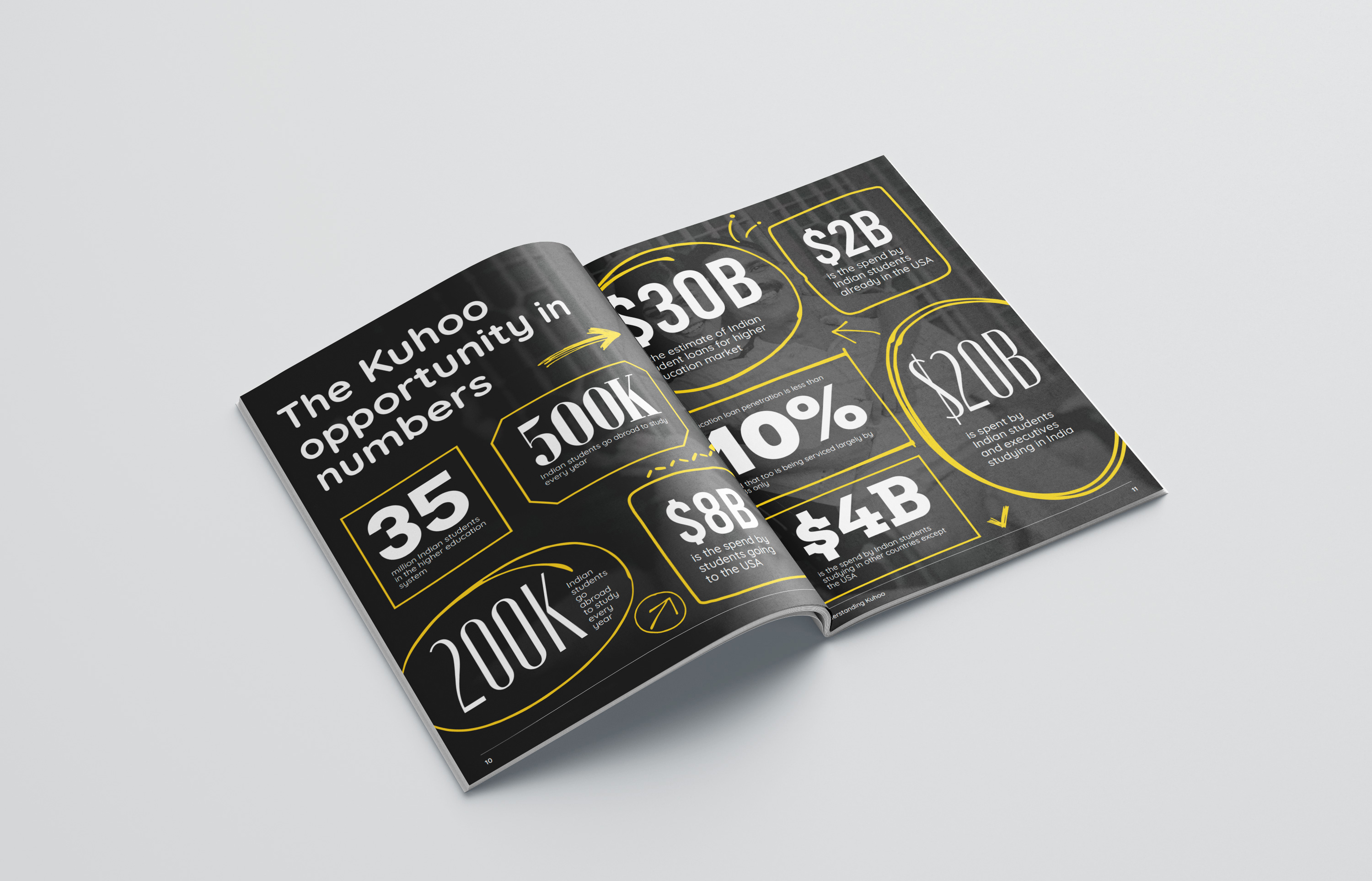
Approximately 35 million students are currently in the higher education system, and about 400,000 students go abroad for their education. The team spoke to a few students and higher education aspirants to understand the process of applying for higher education and the hurdles one has to go through while trying to secure a loan from a bank. This helped us understand how Kuhoo comes into the picture to ease the problem of acquiring an education loan. As Kuhoo enables opportunites for its customers and helps them achieve their dreams, the brand archetype “Hero” suited the brand very well. Once the brand archetype was chosen, the brand tone of voice and persona became clear.

Kuhoo - The Sound of Opportunity
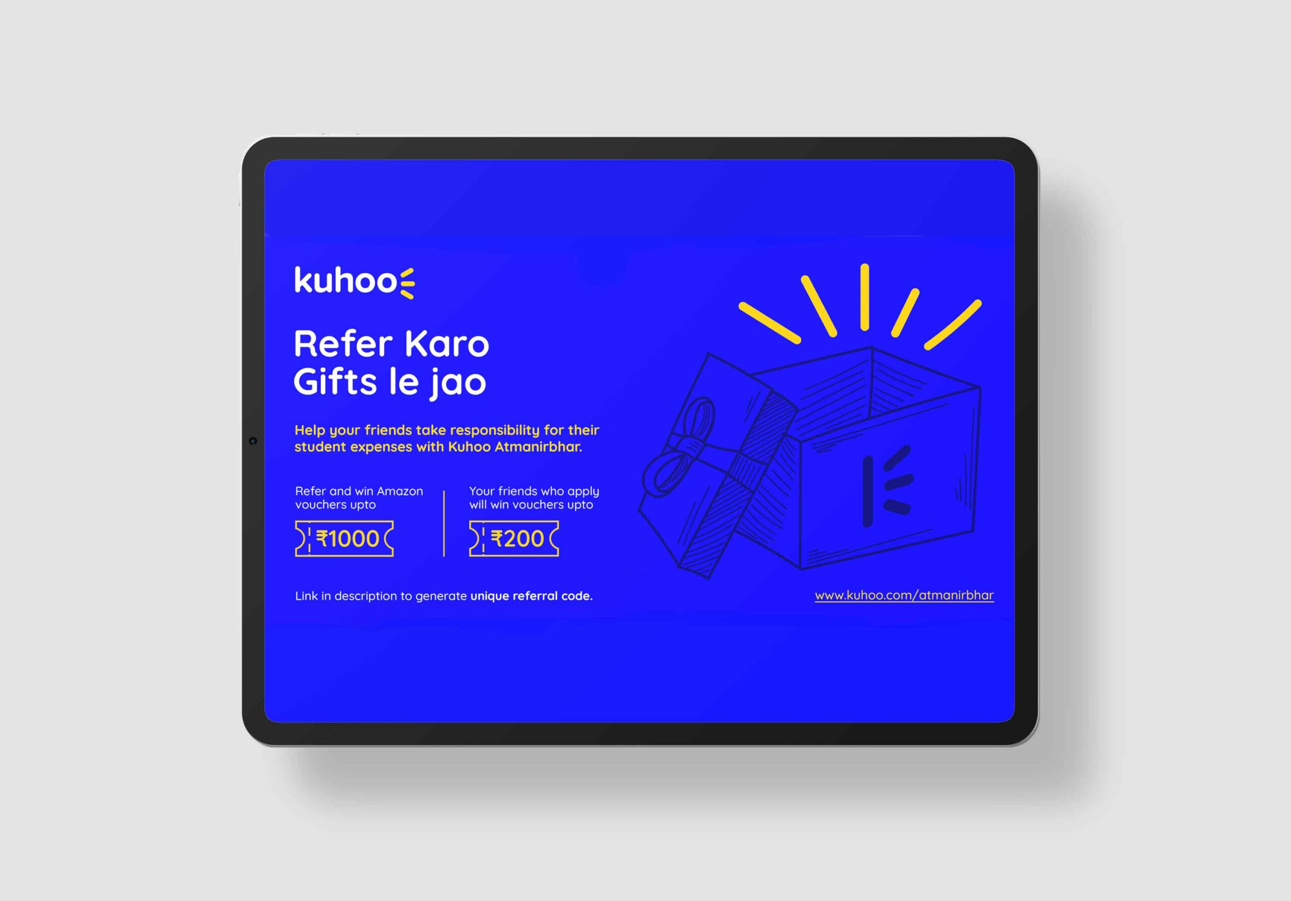
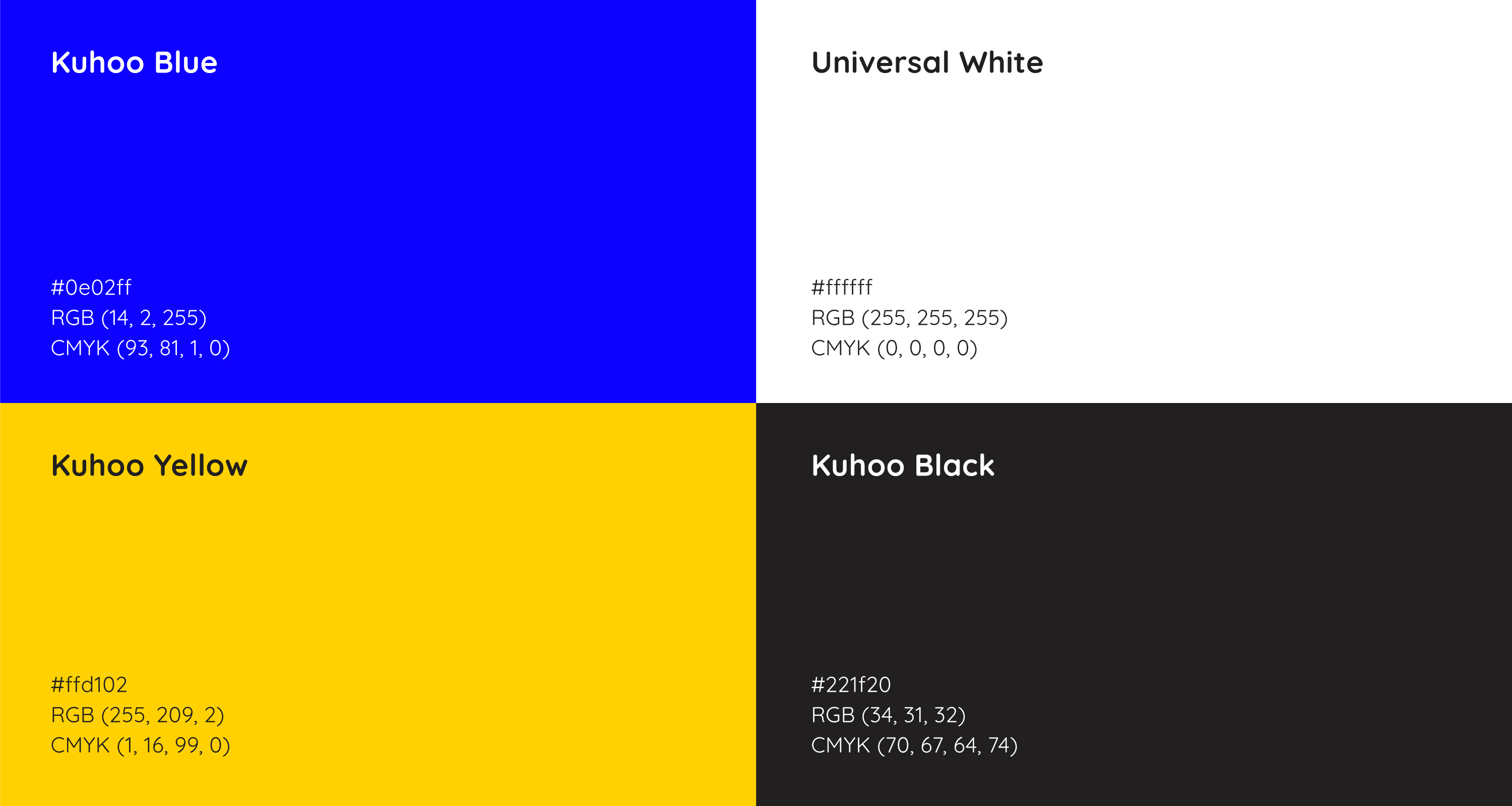
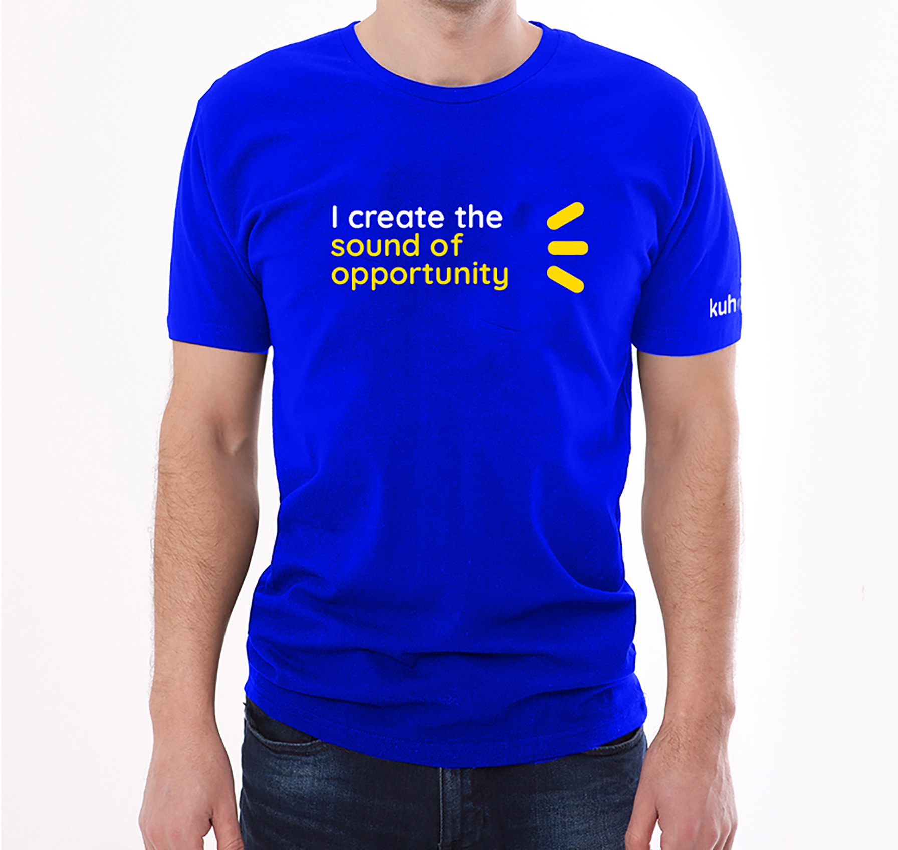
The sound aspect of the name ‘Kuhoo’ became an integral part of it’s identity. The 3 radiating sound lines emanating from Kuhoo symbolize opportunity and prosperity. The ‘Soundmark’ version of the logo, depicted on the left, works as a simple icon carrying the essence of the logo. The logotype as well as the typography selected for the brand is soft and rounded, depicting its friendly and approachable nature. A youthful colour palette was chosen for the identity - a vibrant blue depicting trust and impact and a bright yellow depicting positivity and opportunity. The brand positioning statement - The Sound of Opportunity - also played on the onomatopoeic nature of the name.


Brand assets
The team created the visual language including custom iconography, illustrations, photography treatment, visual layouts and more.


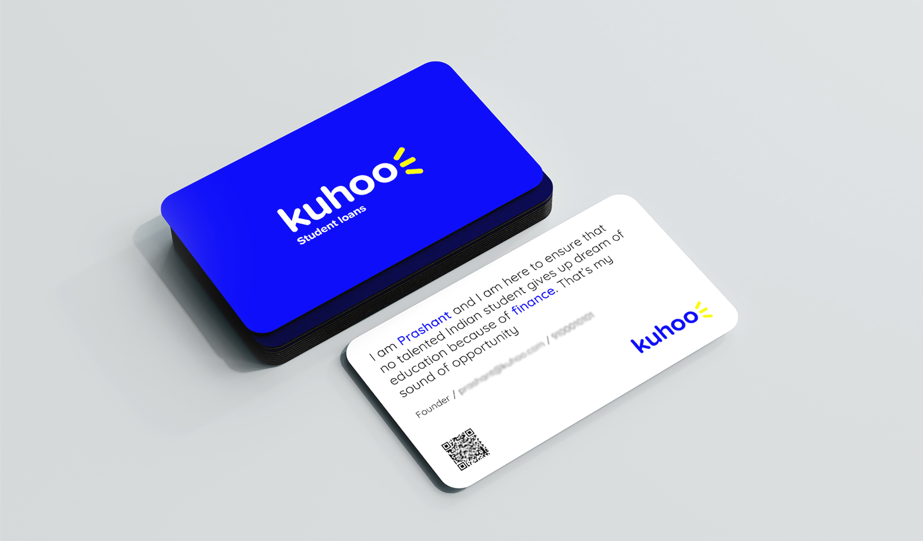
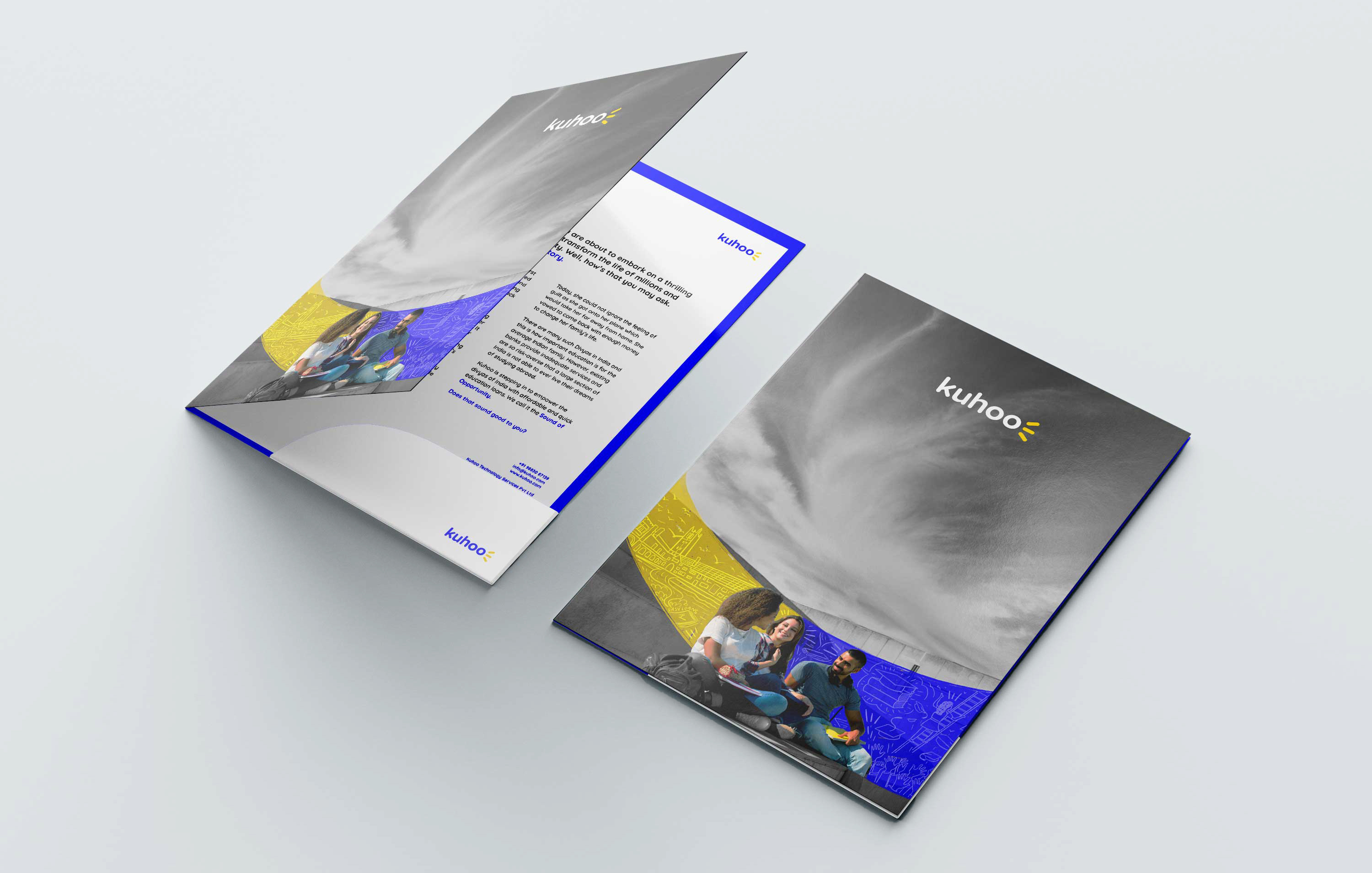

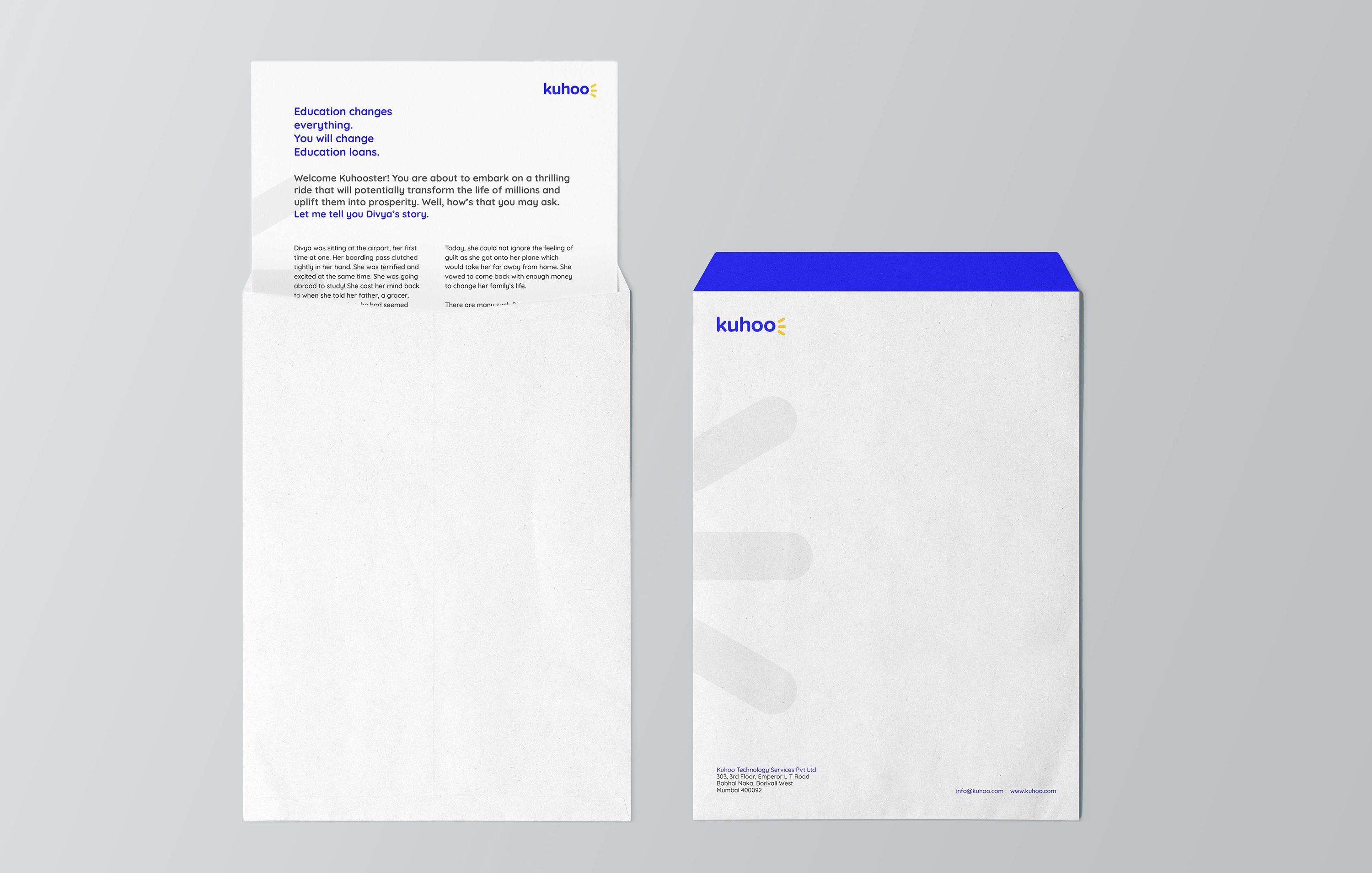
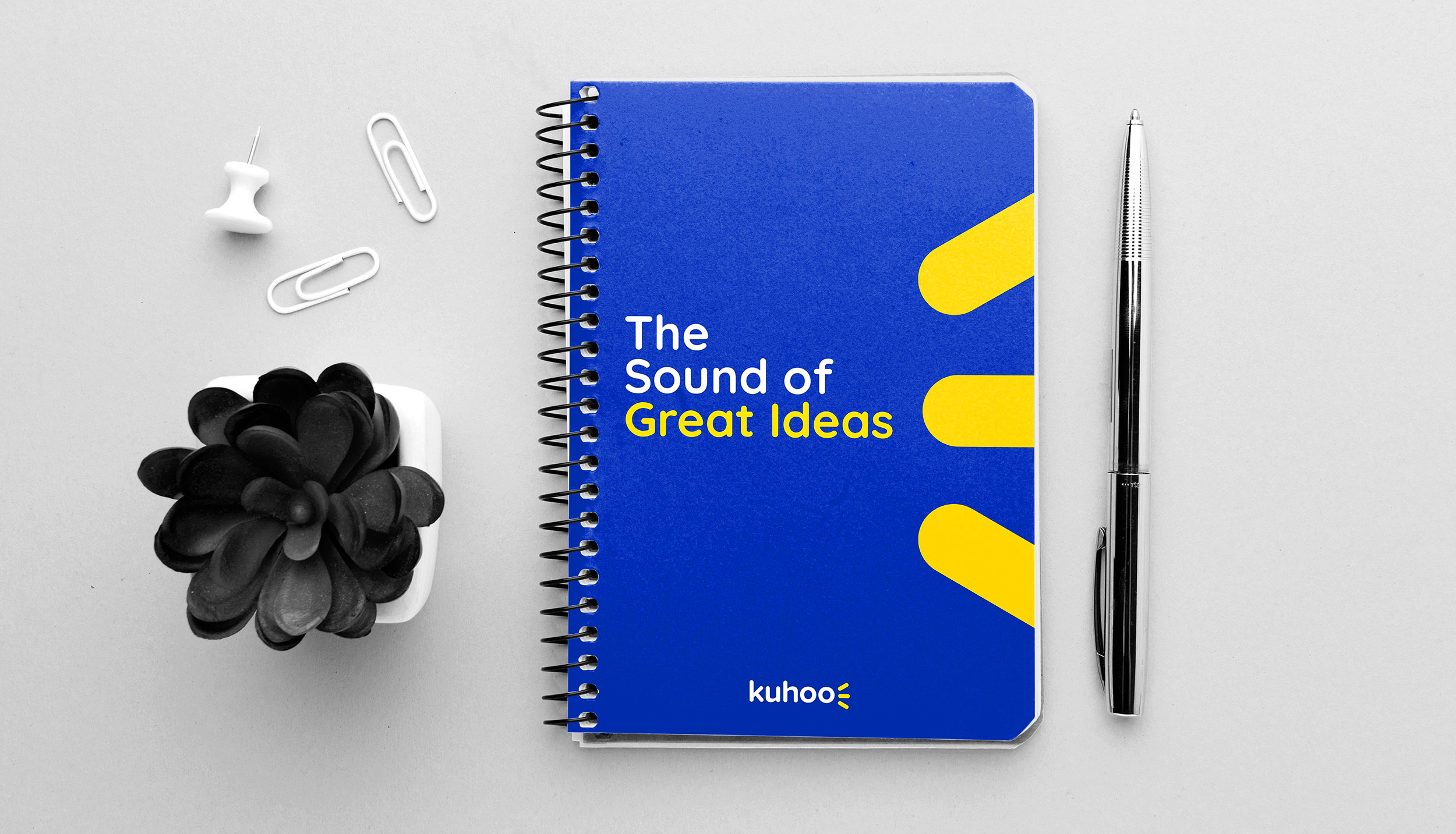
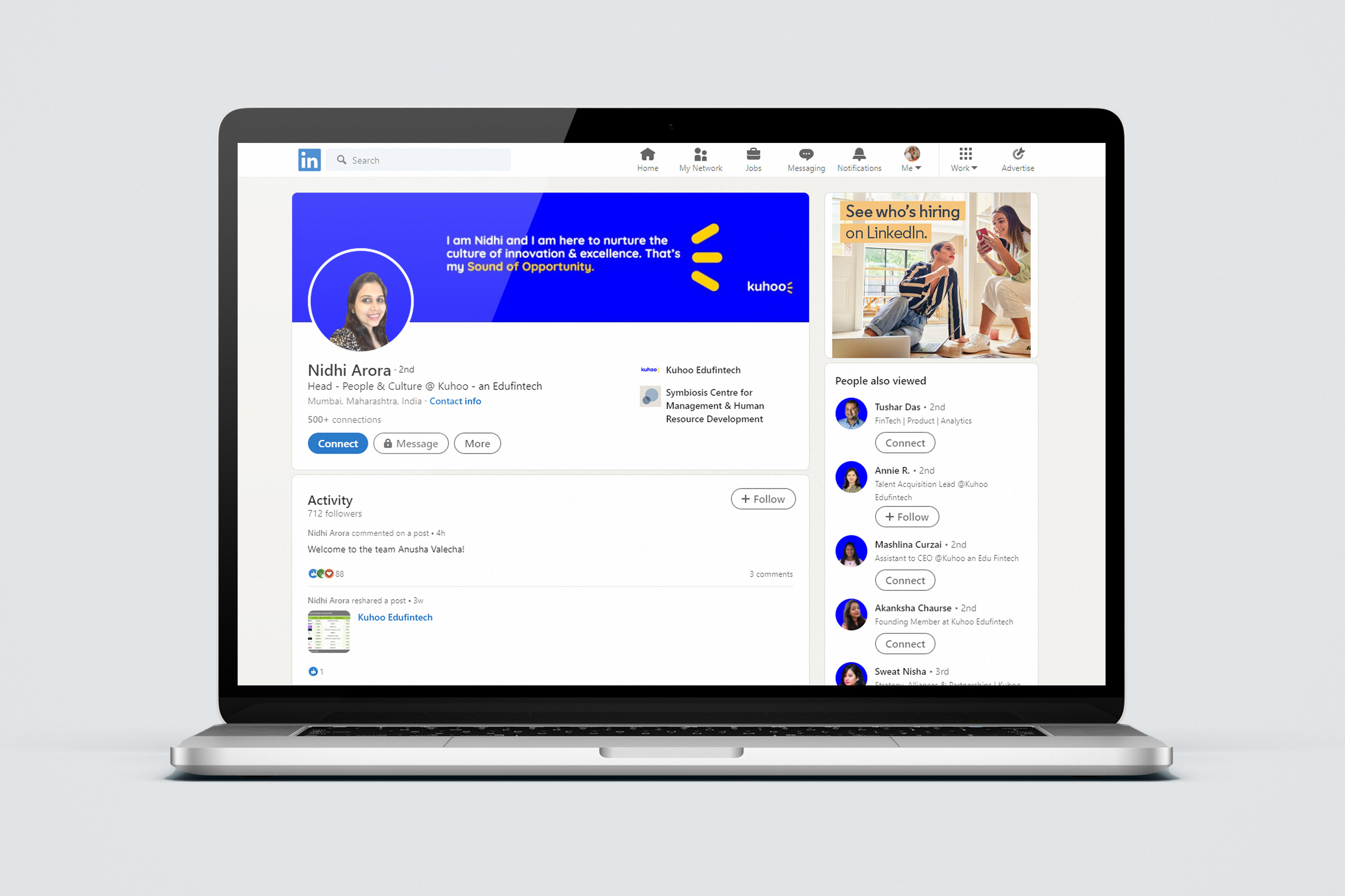
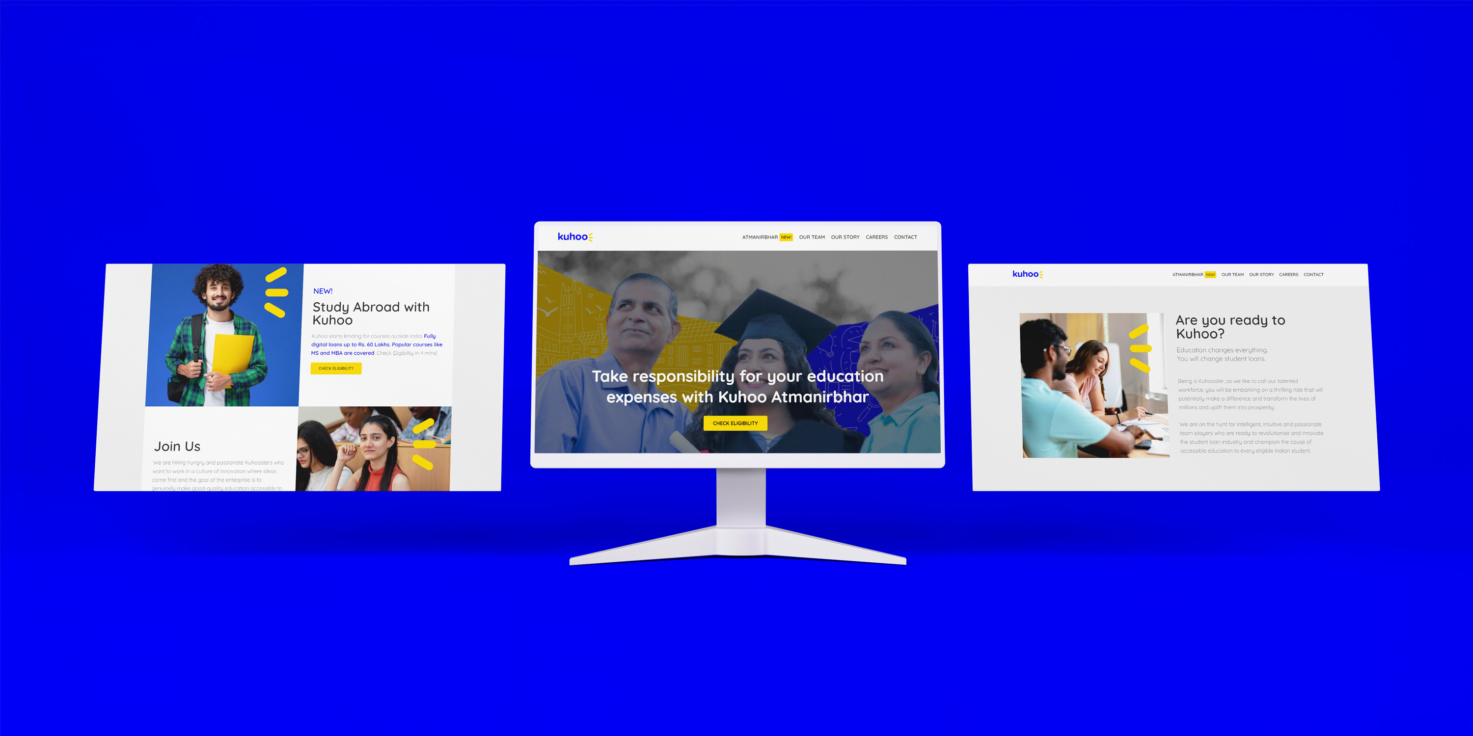
Over 30 unique print and digital applications were created including business cards, letterheads, envelopes, diaries, social media layouts, video snippets as well as a complete website. We also created internal communication material for Kuhoo including offer letters, culture handbook, emailers and onboarding kits. A comprehensive brand guidelines book was created to capture all the style guides.


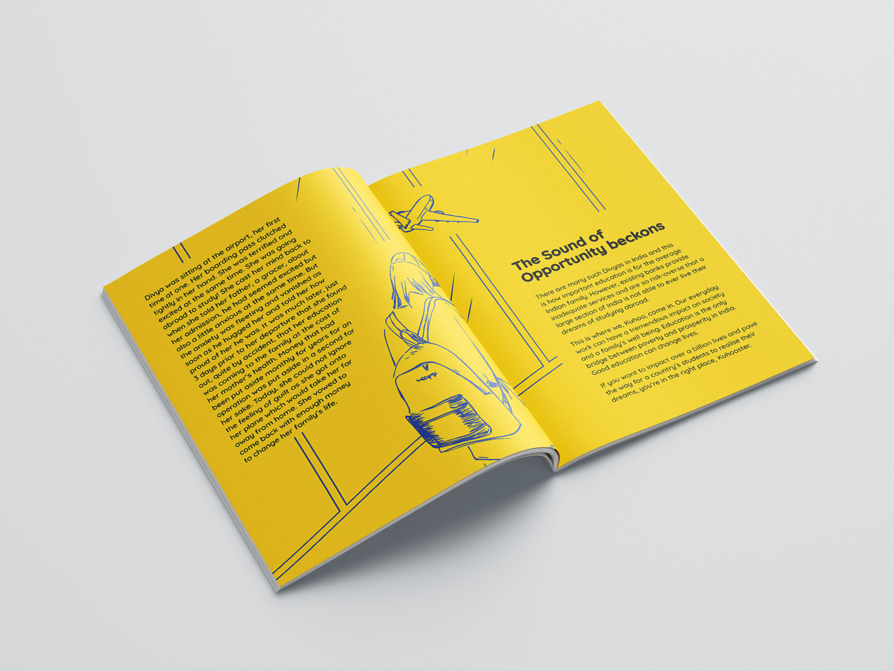
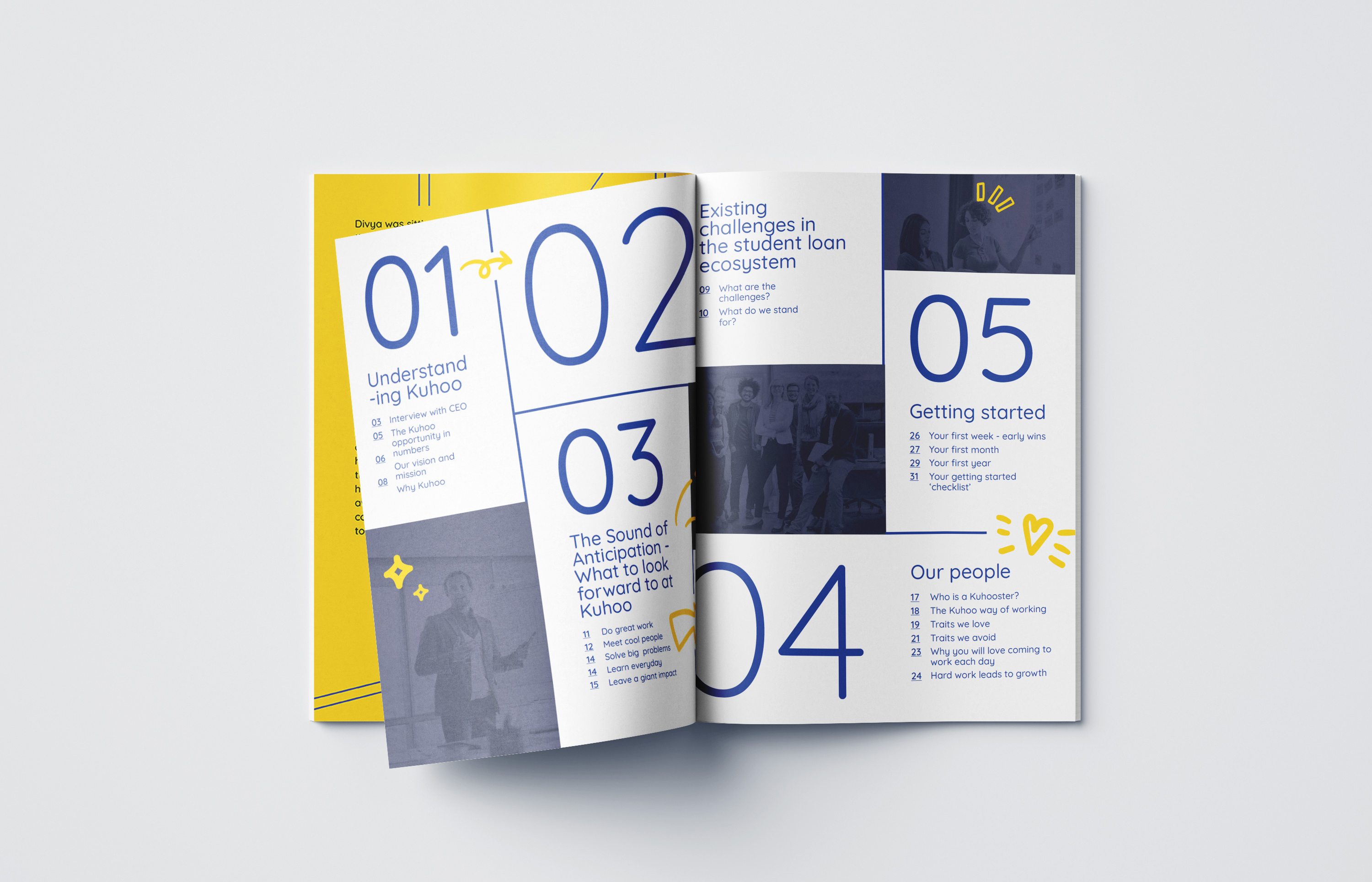
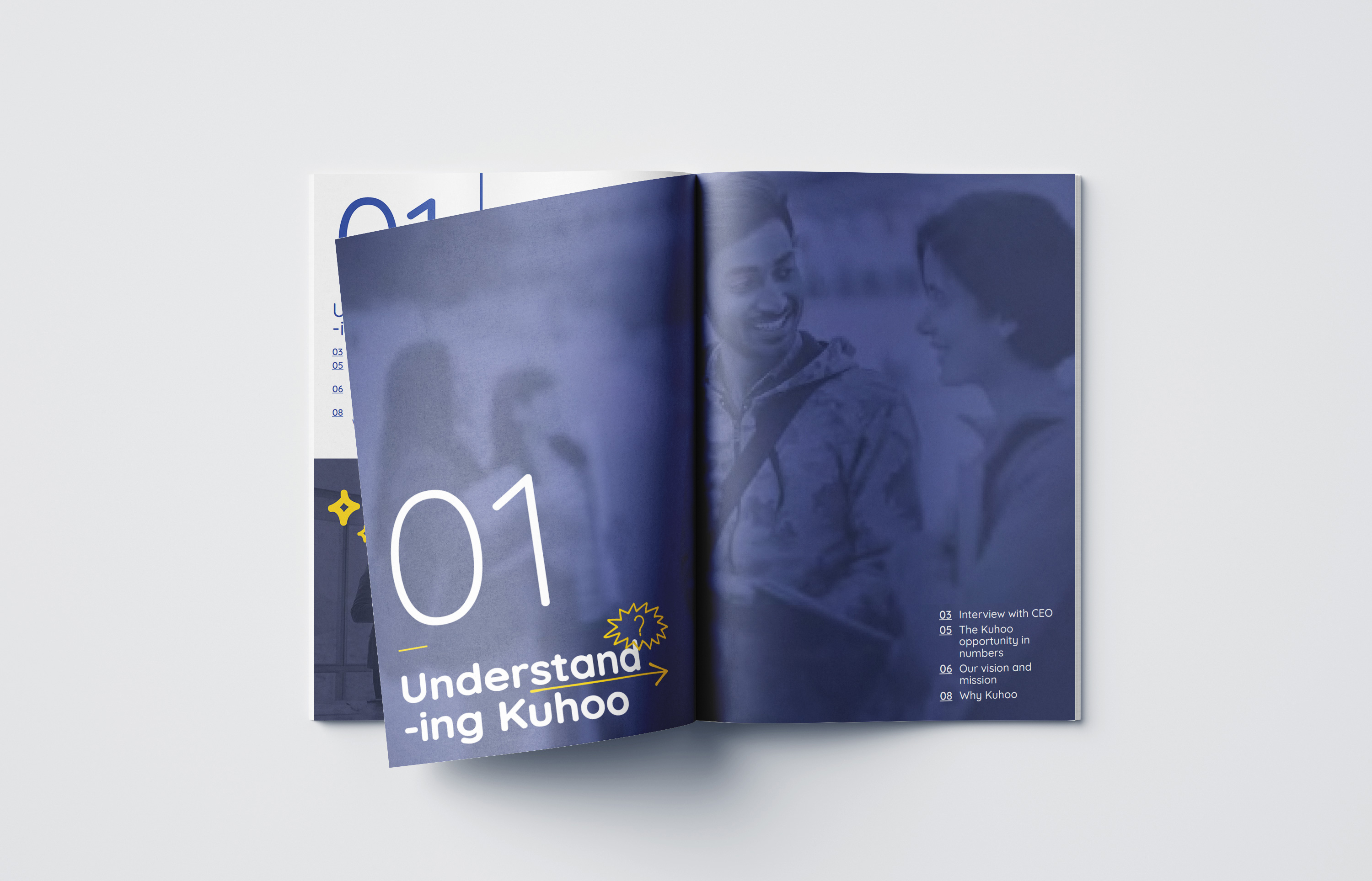
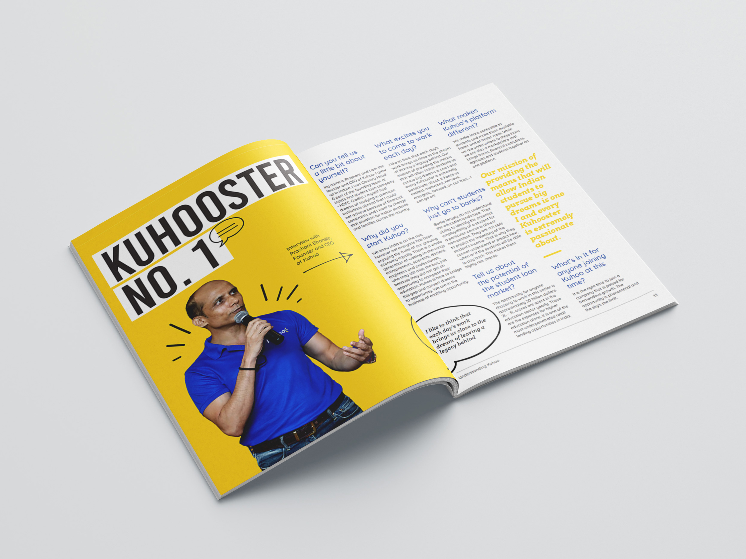
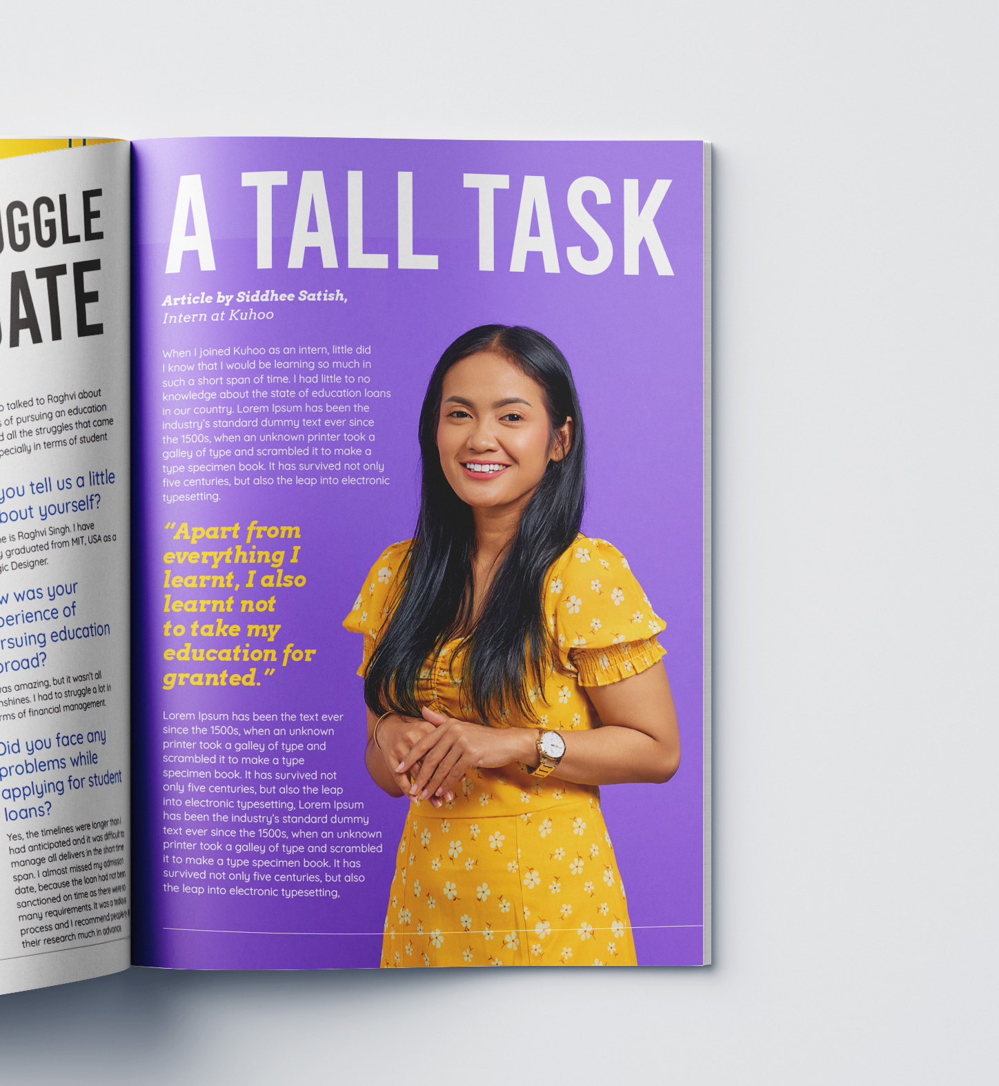
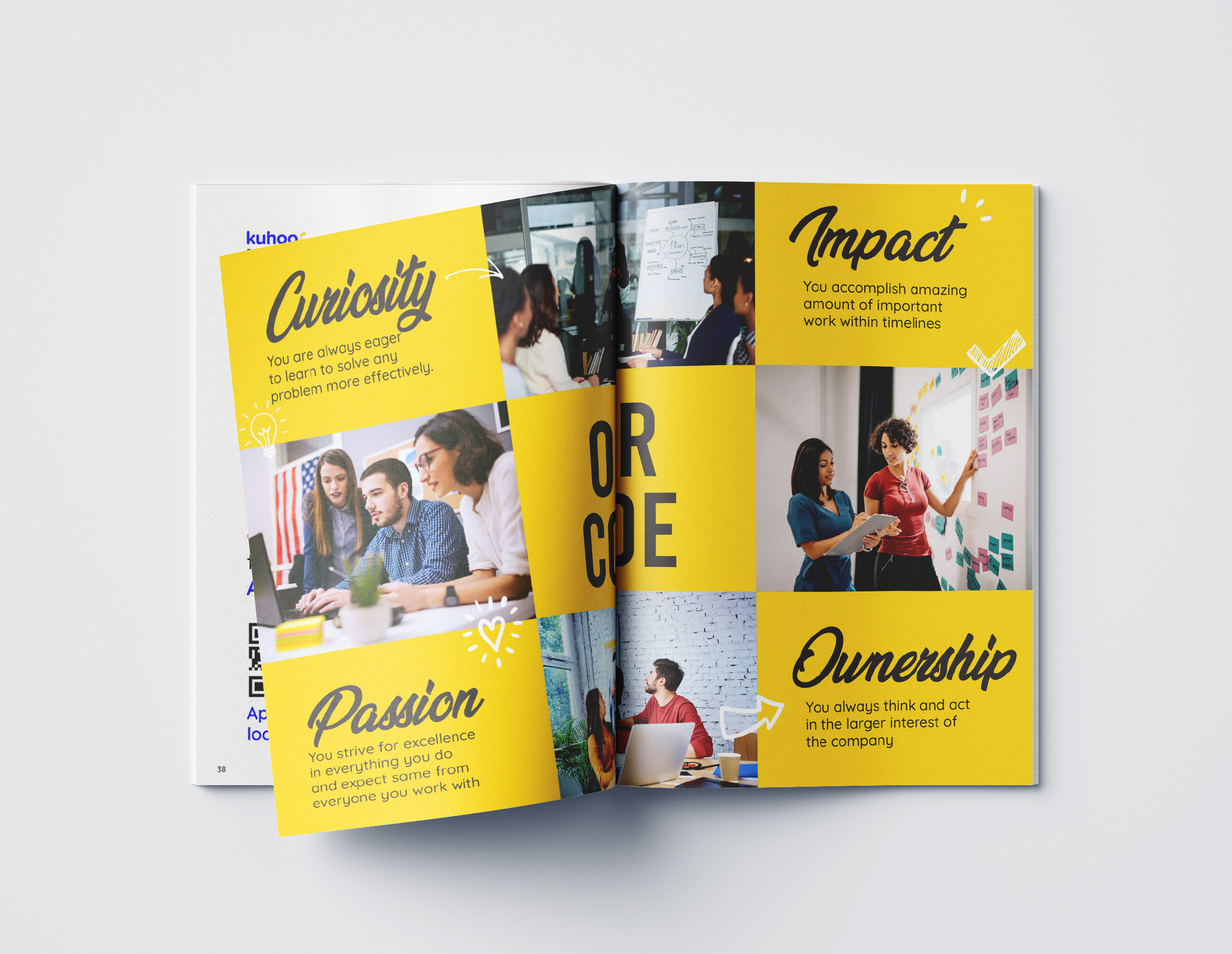
Employee culture handbook
The employee culture handbook was formatted like a magazine making it easier and more fun to read. The messaging in the book communicated the company’s core values, culture and vision thereby inspiring employees about Kuhoo’s ambitious vision. It contained fun sections that mimiced a magazine’s format and had letters to the editor, ads, stories, interview spreads, feature articles and infographics.