Humain Health
brand identity
Design Challenge
SigTuple, a healthtech startup, was launching it’s retail healthcare venture - Humain Health. The challenge was to create a fresh and humane brand identity for Humain Health.
Solution
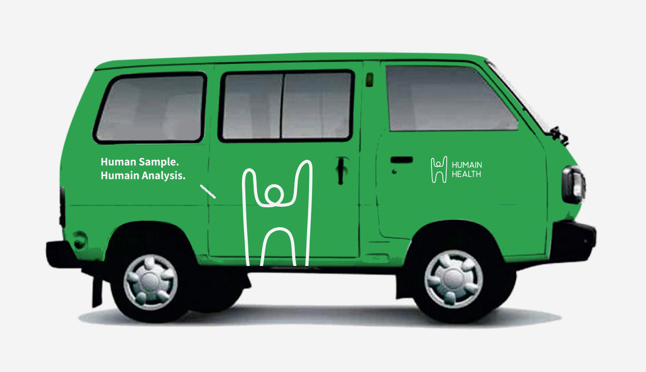
The brand identity represents the outcome of what Humain Health aims to achieve - healthy and happy human beings. The logo is a human being - drawn with a single line - raising its arms in health and happiness.
The brand identity was a comprehensive design exercise that covered over 40 unique applications. We created the brand archetype, tone of voice, messaging, brand applications as well as healthcare centre graphics that scaled to several clinics across the country.
SigTuple, a healthtech startup, was launching it’s retail healthcare venture - Humain Health. The challenge was to create a fresh and humane brand identity for Humain Health.
Solution
The brand identity represents the outcome of what Humain Health aims to achieve - healthy and happy human beings. The logo is a human being - drawn with a single line - raising its arms in health and happiness.
The brand identity was a comprehensive design exercise that covered over 40 unique applications. We created the brand archetype, tone of voice, messaging, brand applications as well as healthcare centre graphics that scaled to several clinics across the country.
Role ︎︎︎ Lead designer, art director
Type of work ︎︎︎ Brand identity design
Studio ︎︎︎ Rezonant Design
Team ︎︎︎ MP Hariharan, Pranav Mathur, Vinayak Baby, Ajeesh M, Hisam Puthalath, Jayesh Paroli
Published ︎︎︎ 2018
Type of work ︎︎︎ Brand identity design
Studio ︎︎︎ Rezonant Design
Team ︎︎︎ MP Hariharan, Pranav Mathur, Vinayak Baby, Ajeesh M, Hisam Puthalath, Jayesh Paroli
Published ︎︎︎ 2018
Logo locking guidelines
![]()

Brand Archetypes
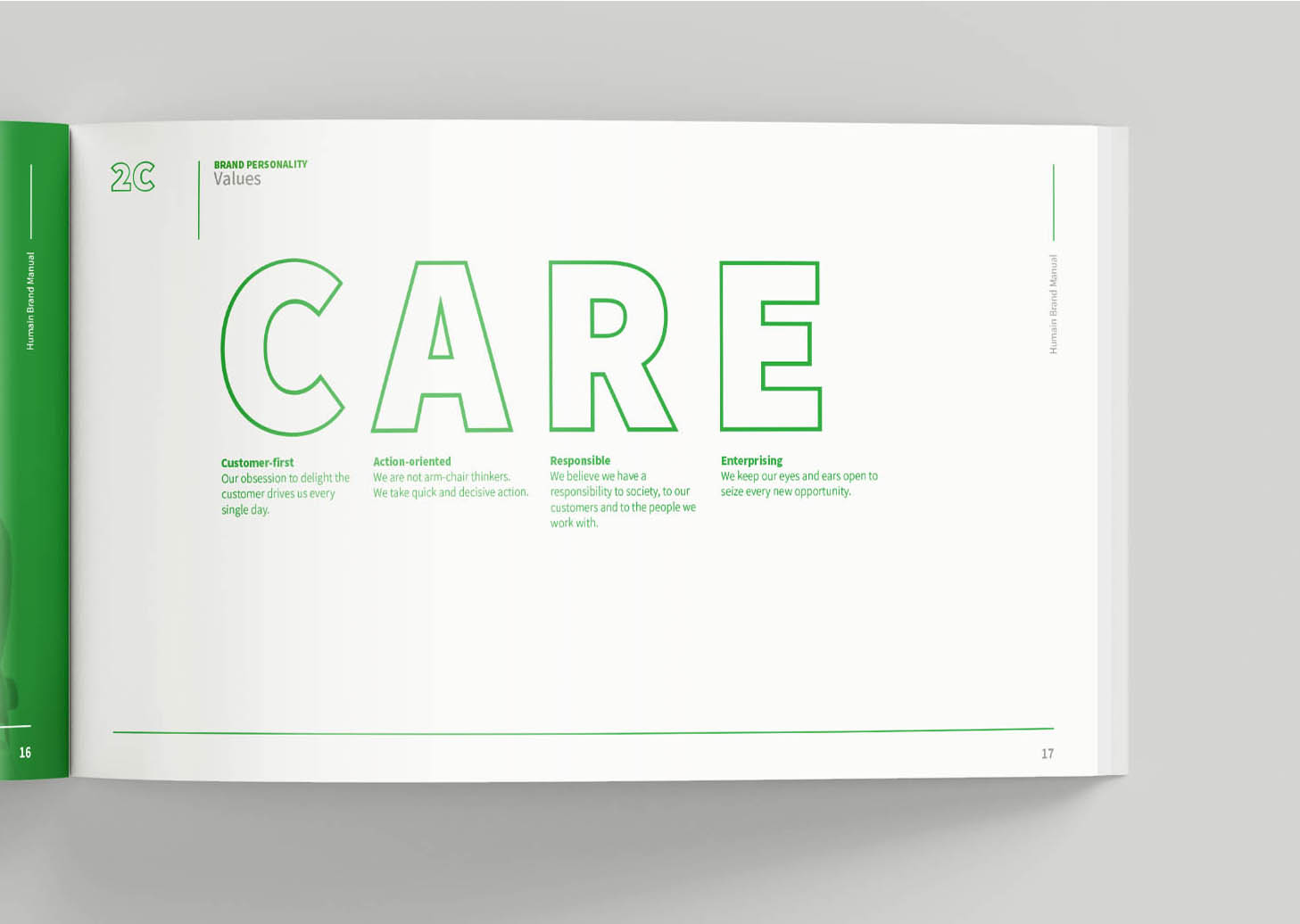
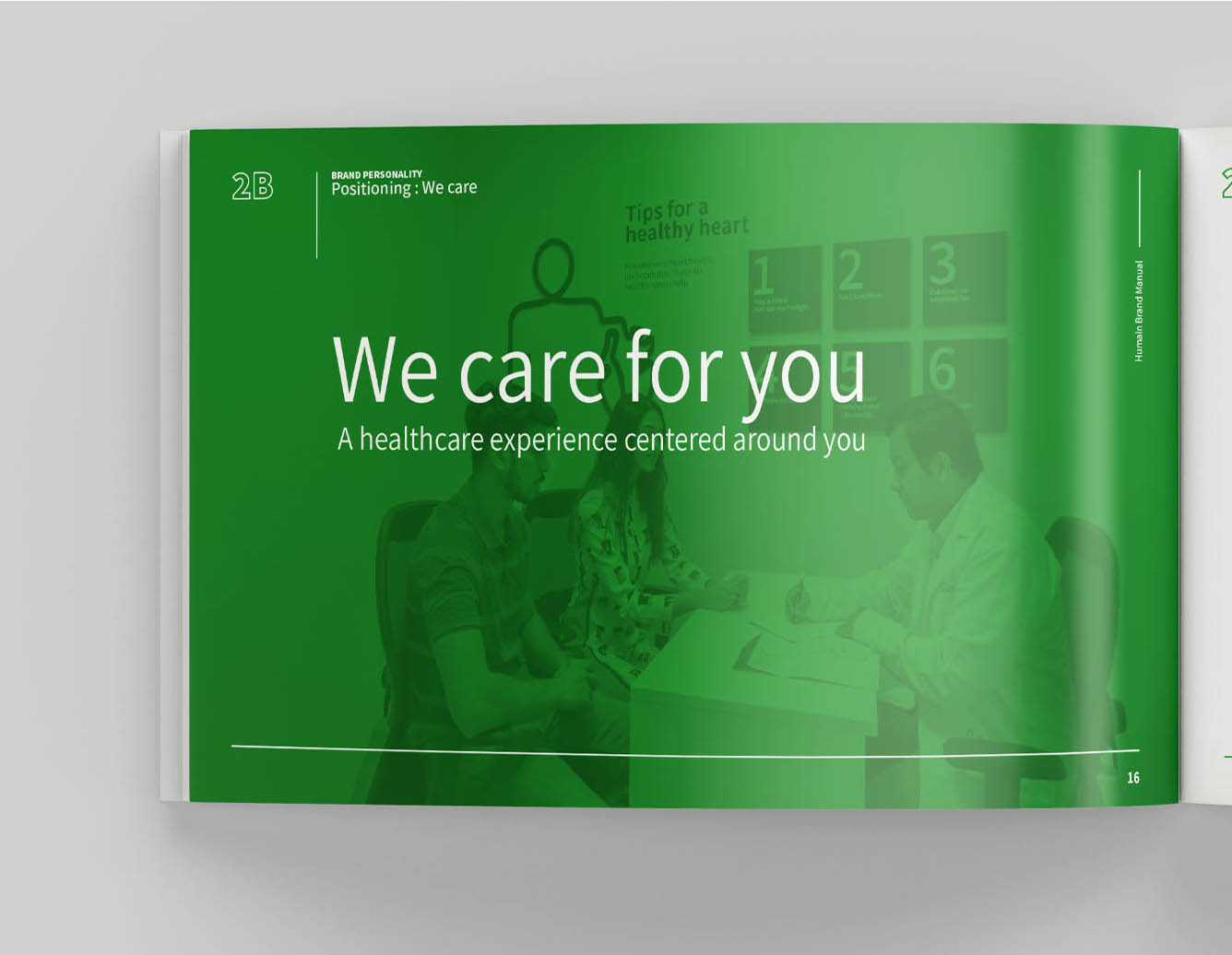
The primary brand value for Humain Health was caring for patients above all. Thus the brand archetype created for Humain Health was a mix of Nurturer and Hero. Nurturer because Humain Health is caring, supportive and compassionate and Hero because they fight for what is right and are a kind of hero to patients in need. The positioning line - We care for you - was created to support this archetype. The brand voice was to be informative, professional and helpful.
All the brand messaging and content created followed the archetype persona and retained the same tone of voice.

Typography & Colour Palette
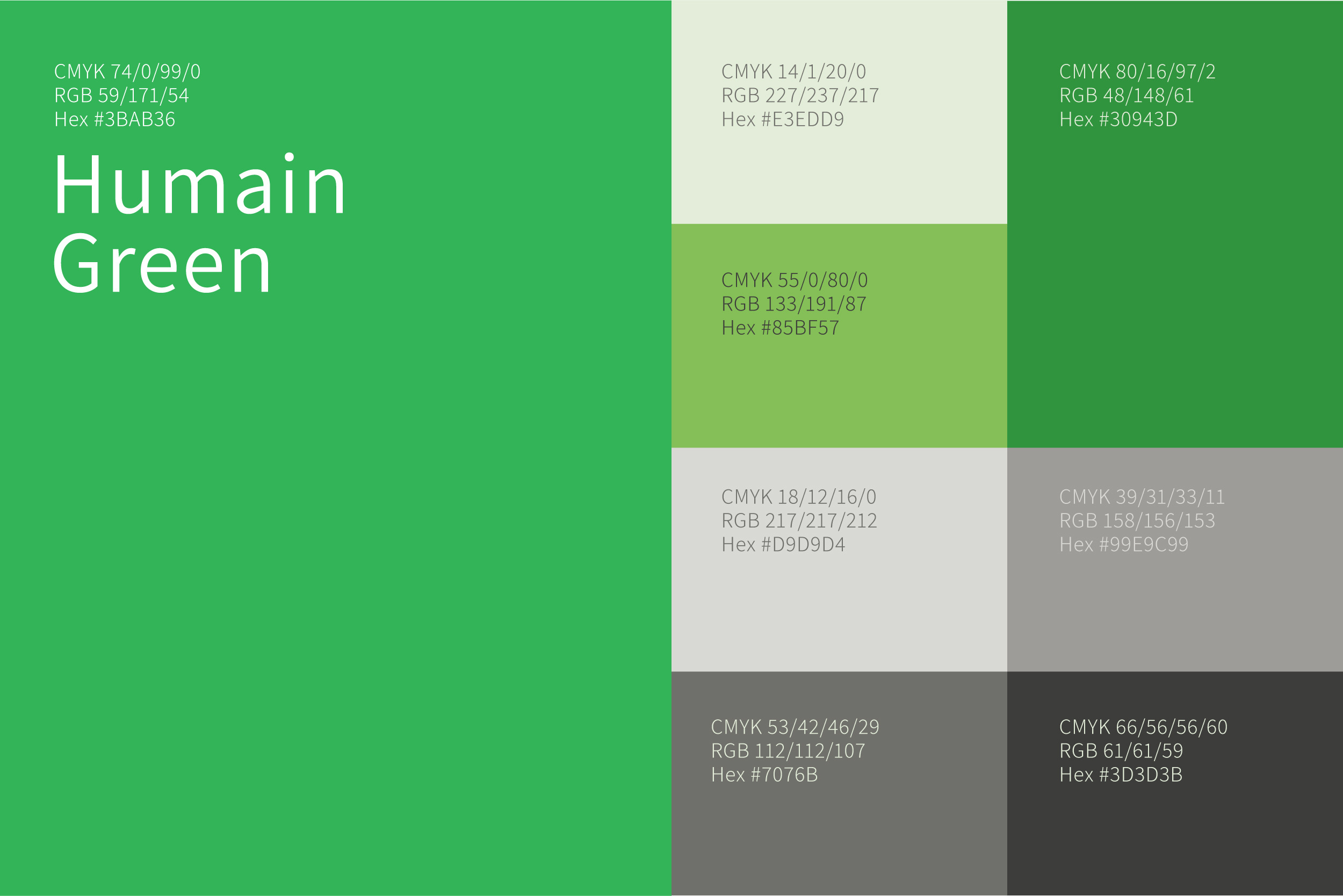
A refreshing share of green was chosen as the primary colour of the brand. Blue, yellow and greys formed the supporting colour palette.
For typography, the Assistant typeface was chosen. Clean, contemporary and unassuming, this sans serif typeface has great readability and was a perfect fit for the brand.

Iconography
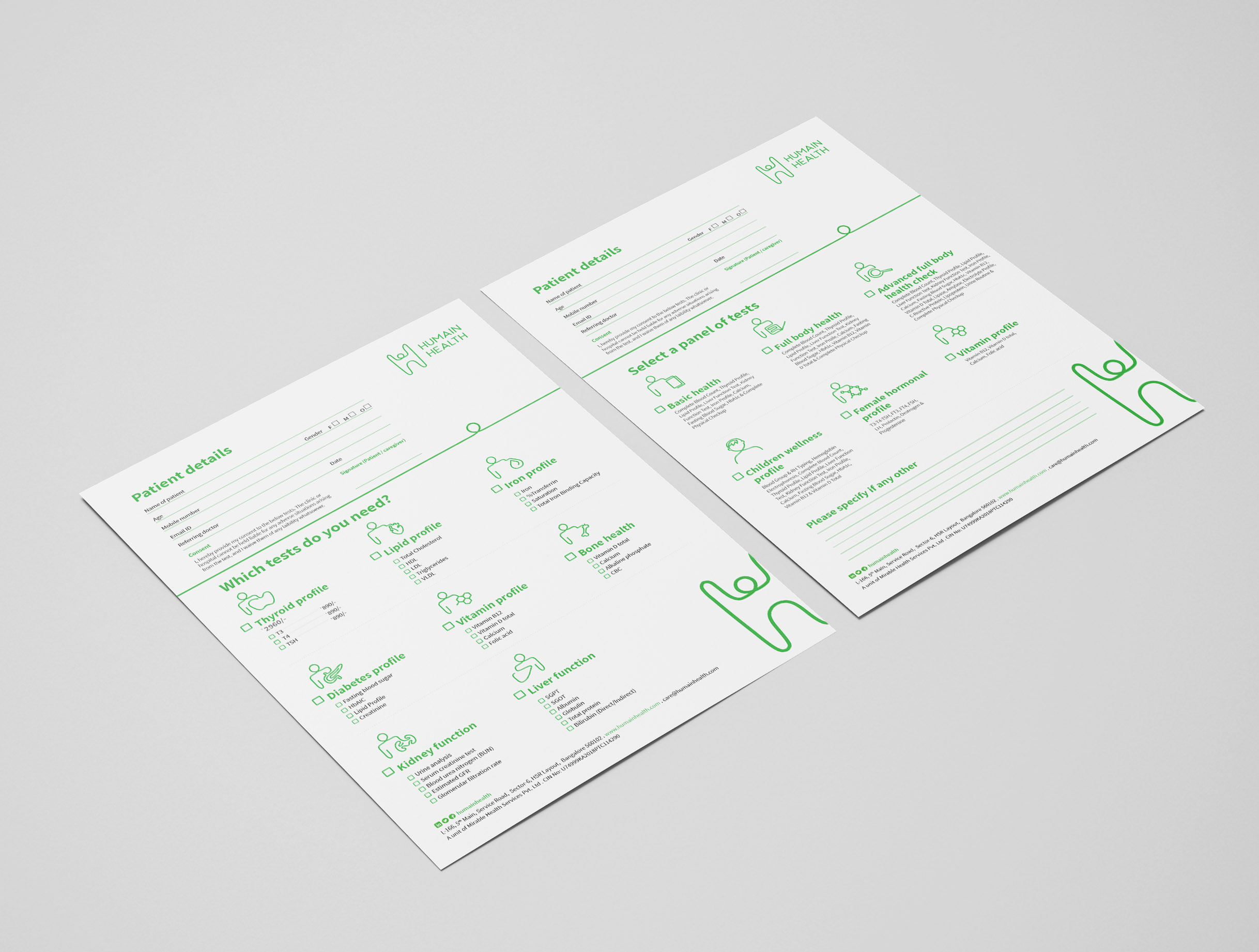
A set of icons was created for use across different print as well as digital applications.
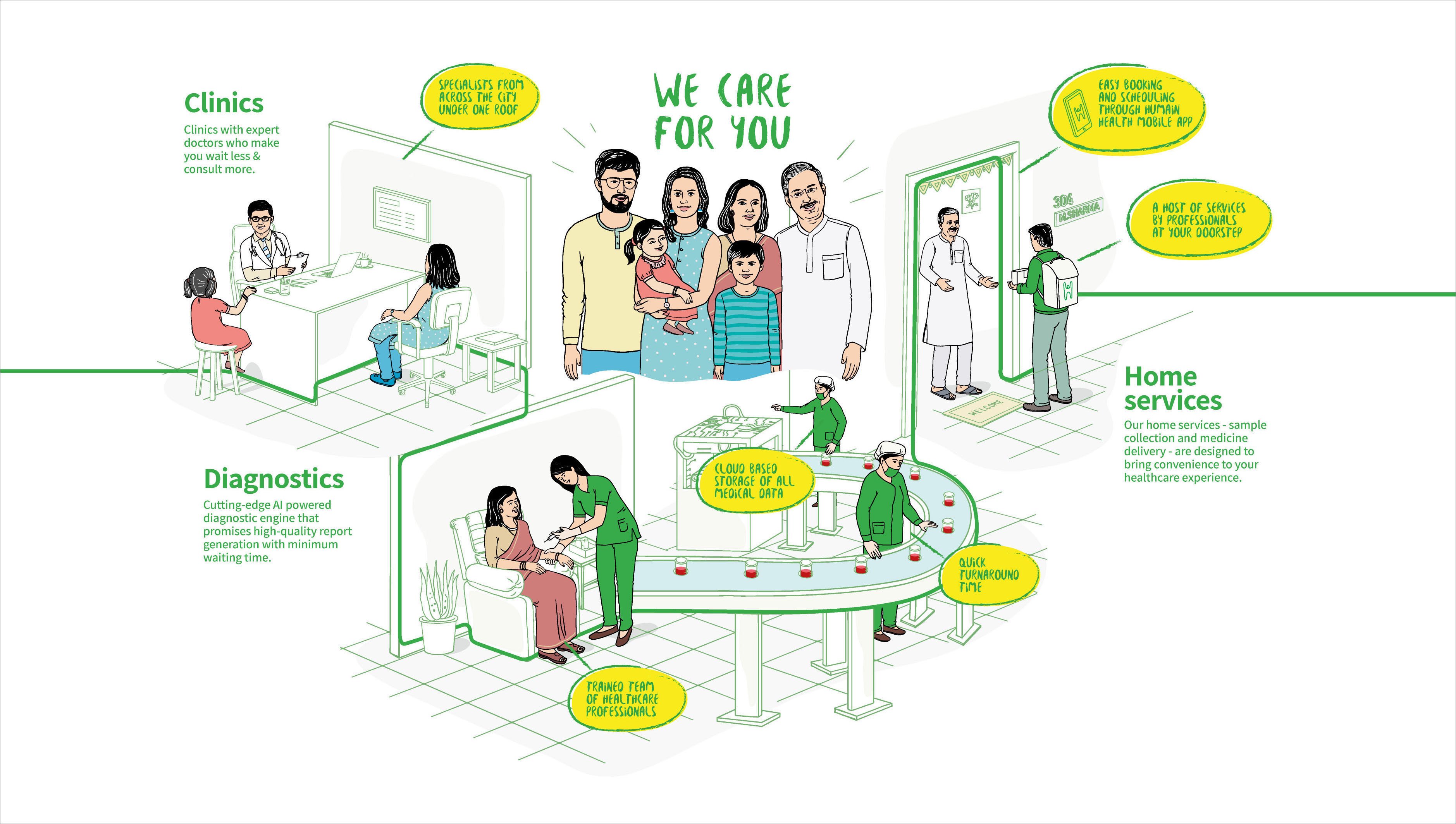
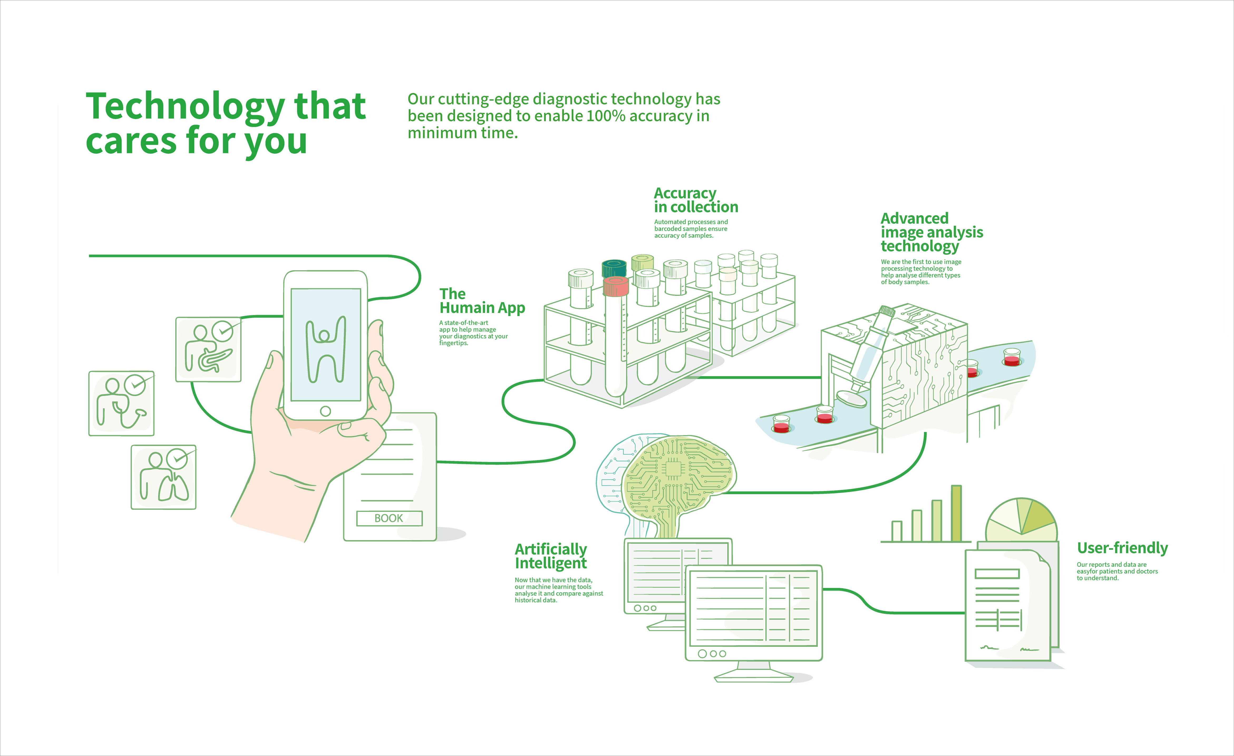
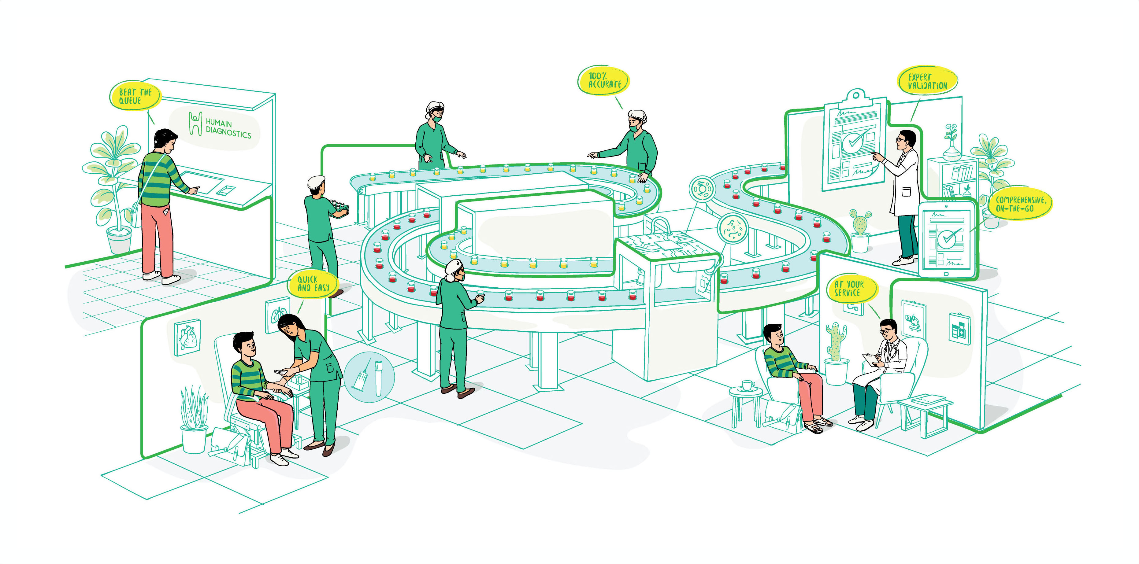
Brand illustrations
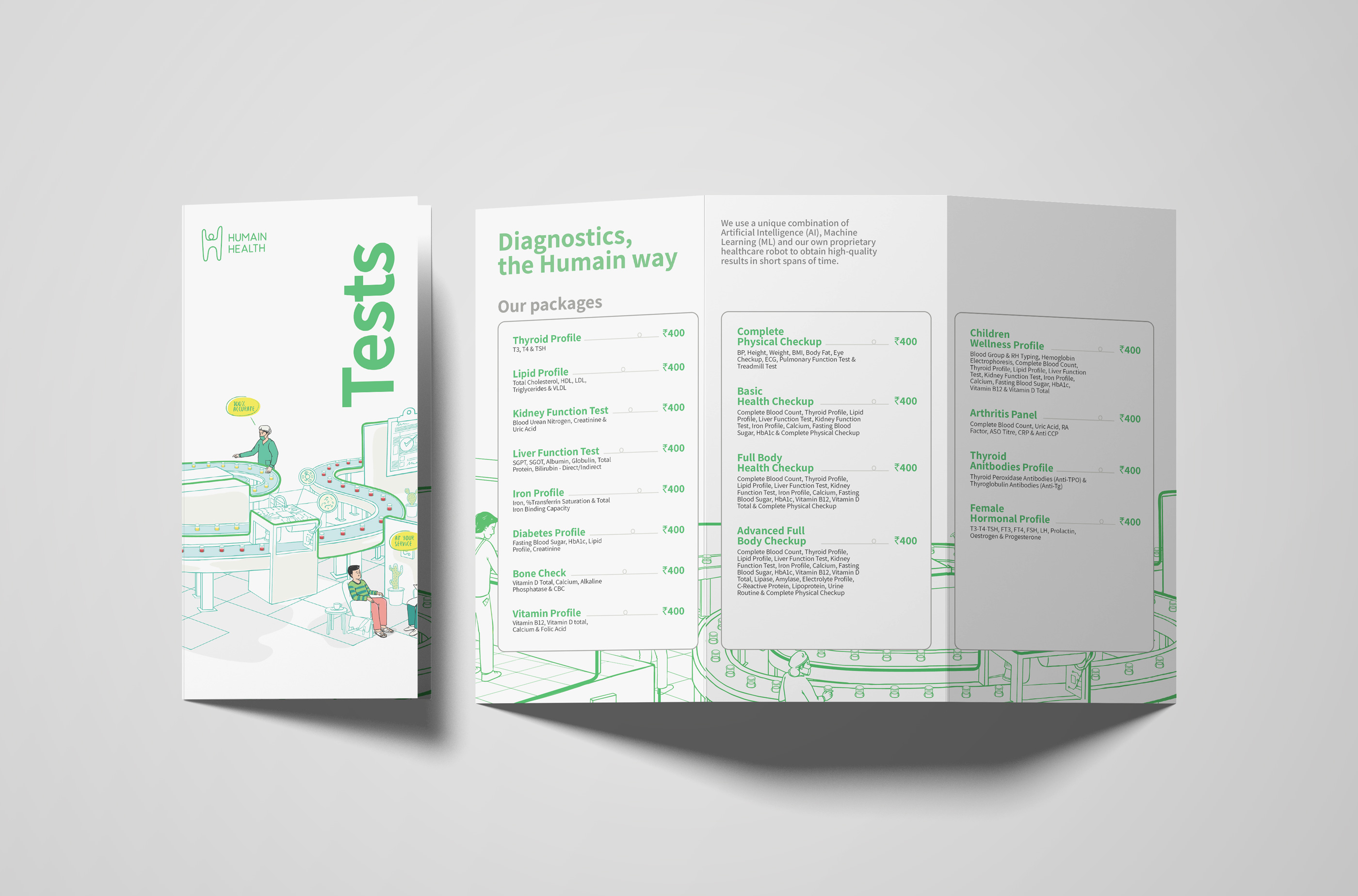
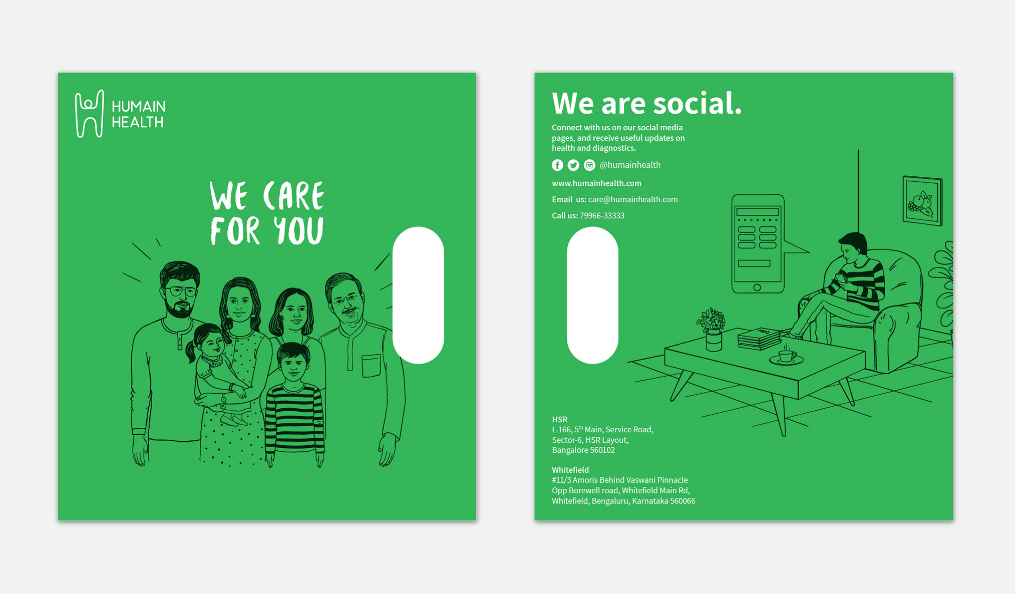
A series of brand illustrations were created that highlighted the different offerings and features of the brand.

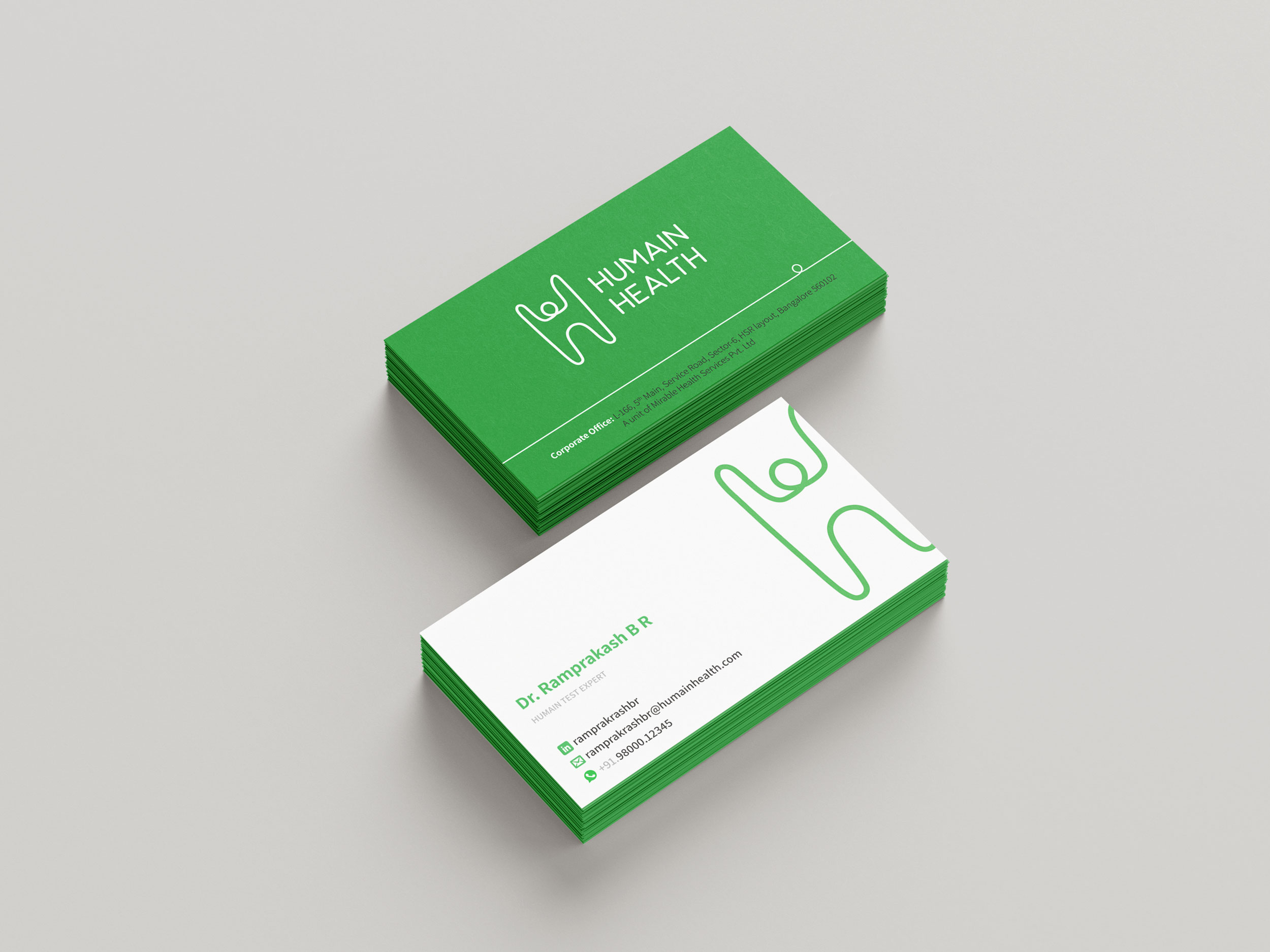 Business cards and other stationery