DF mSafety platform
UI & UX
Design Challenge
DataFoundry’s mSafety is a cloud-based safety platform that uses the power of AI/ML and automation to deliver efficiencies and a great user experience in Safety Case Management and Signal Detection for drugs, cosmetics, vaccines, neutraceutical and medical devices. We were tasked with improving their UX and creating a better and easy-to-use UI for their platform.
Solution
The team worked on understanding the different user personas and various requirements of each role. We then worked on translating complicated tasks into simpler flows. Simple interventions like dashboards, data visualizations and colour coding helped make the platform easier to use.
Role ︎︎︎ Creative lead, designer
Type of work ︎︎︎ UI & UX design for cloud platform
Studio ︎︎︎ Rezonant Design
Team ︎︎︎ MP Hariharan, Hisam Puthalath
Published ︎︎︎ 2020
Type of work ︎︎︎ UI & UX design for cloud platform
Studio ︎︎︎ Rezonant Design
Team ︎︎︎ MP Hariharan, Hisam Puthalath
Published ︎︎︎ 2020
Understanding product innovations and user personas
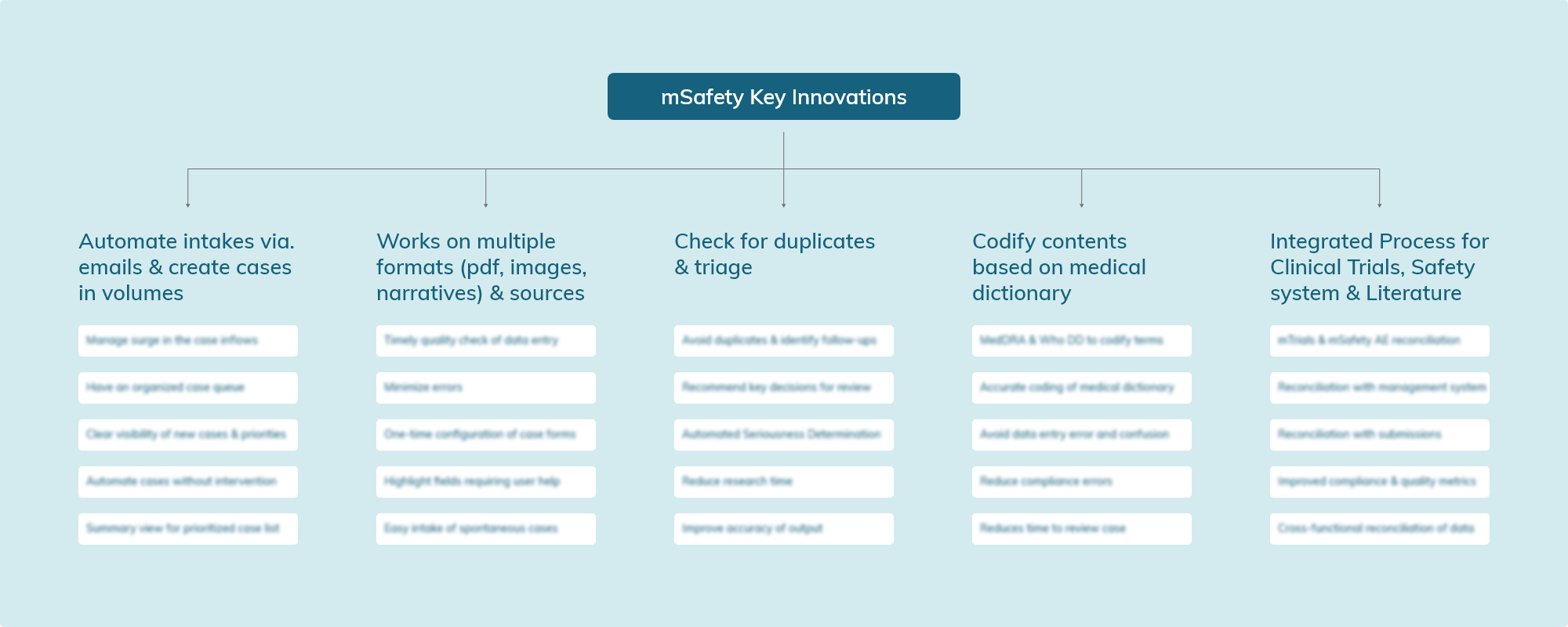
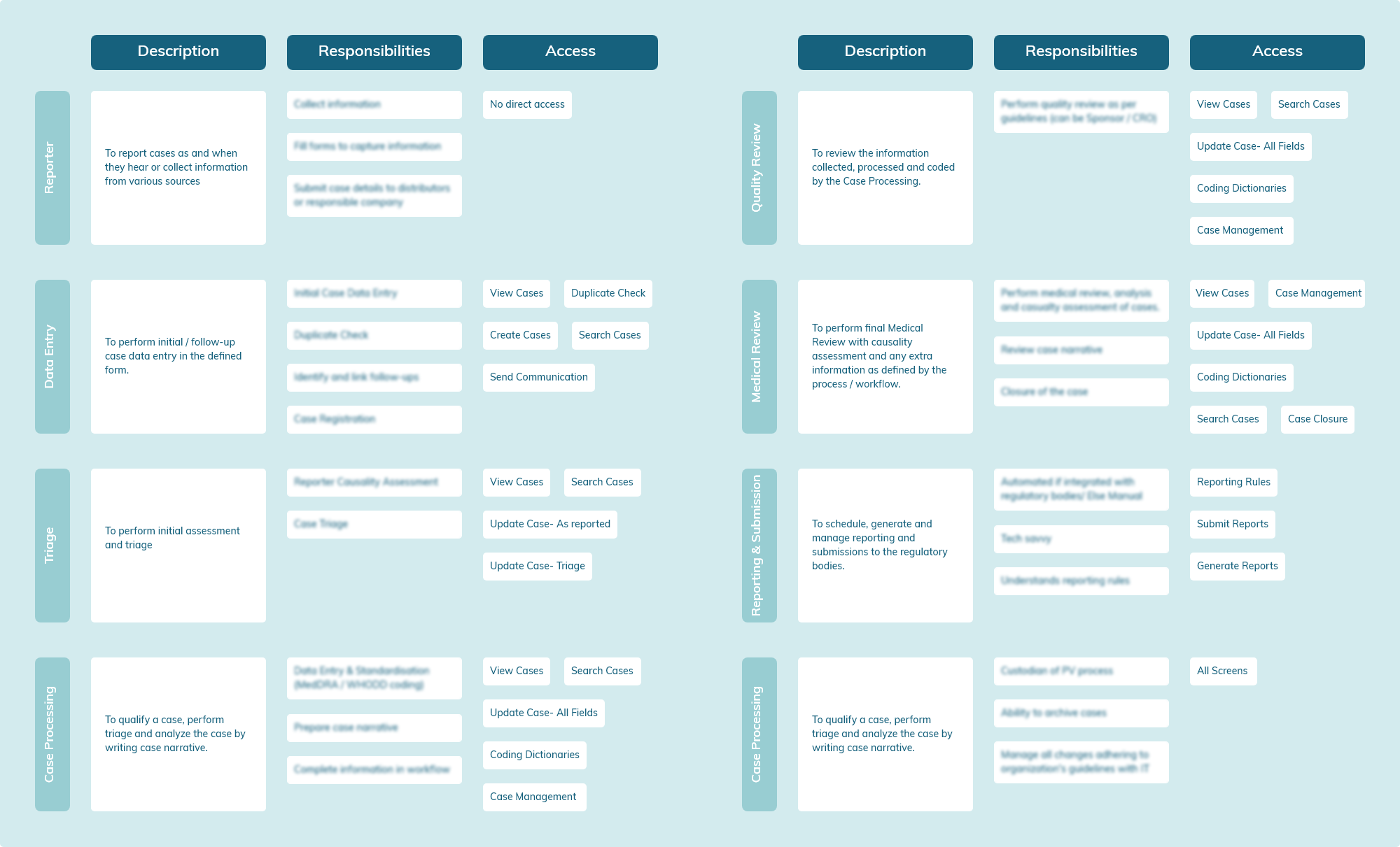
mSafety is a product catering to pharmaceutical and medical institutions. With pressure on safety departments to constantly innovate to catch up with the increasing number of adverse effects being reported, mSafety innovates on different levels to cater to the needs of the market.We had several sessions with the DataFoundry team to understand the user personas and the various needs of each role. Working with a list of people who would use the application, we fleshed out the personas to understand how each employee would use and interact with the software based on their position and the different levels of access each of them would have to the interface.
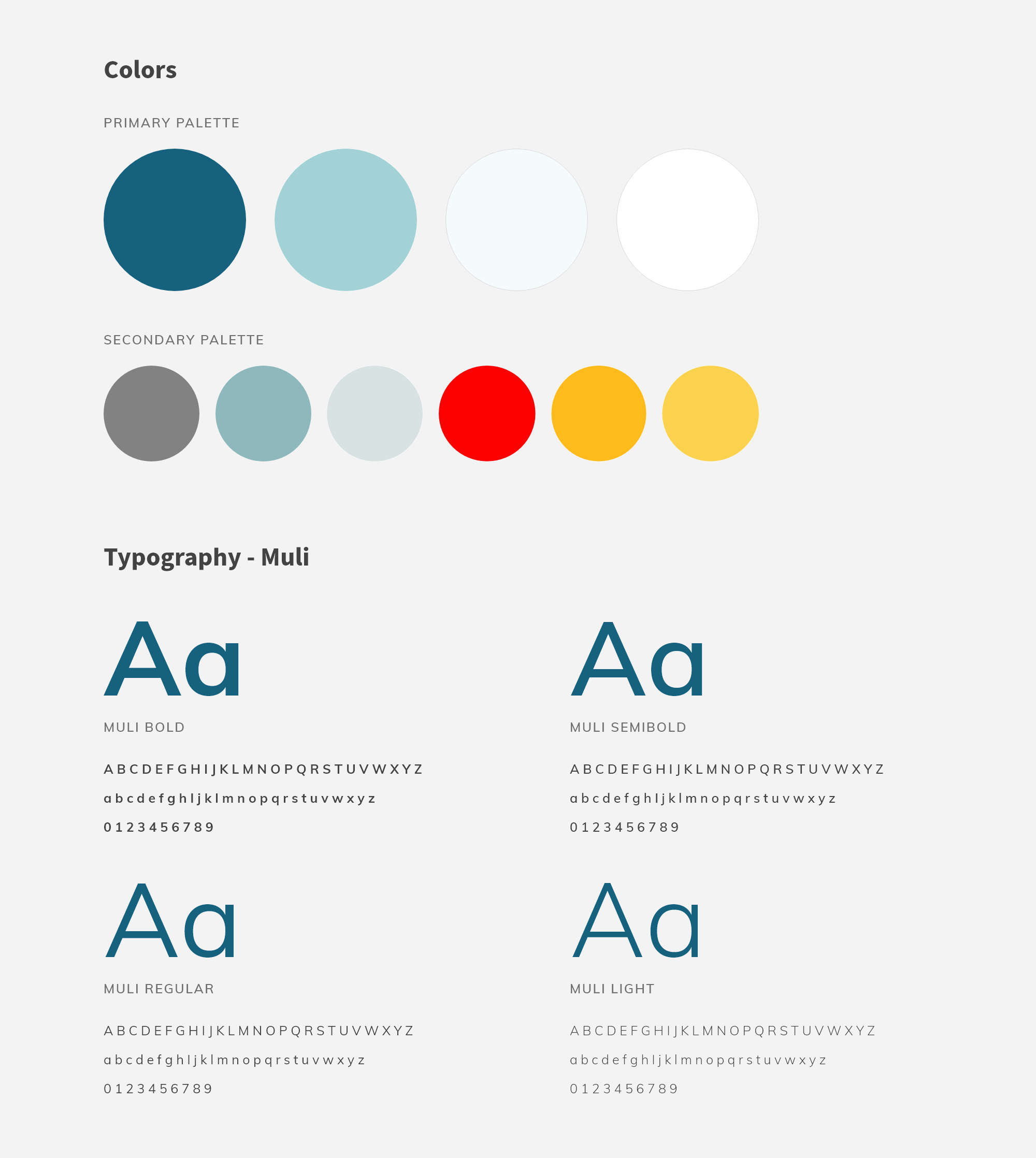
Colours, Typography & Iconography
Using various combinations and colours, we experimented to find a colour palette that suited the AI-based platform. We wanted to ensure that the colours chosen helped the information stand out. The team decided to go with Muli, a contemporary sans serif type family that would be highly readable as well as appear friendly. Simple and clean icons were selected.
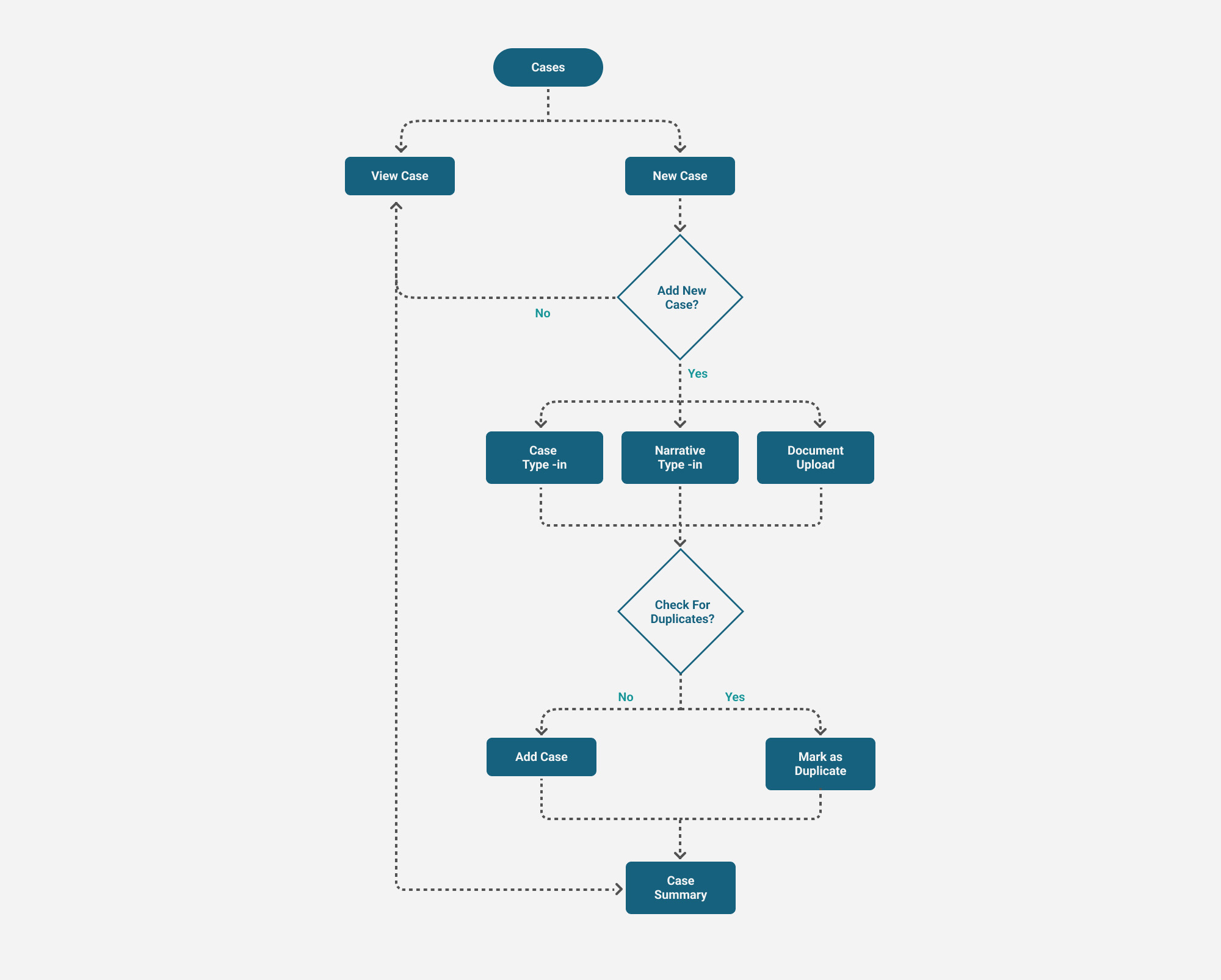
Since a lot of the innovation that mSafety has is around the intake of cases, we created an intuitive flow for uploading a case. We created forms for each intake flow which made the case upload process faster.
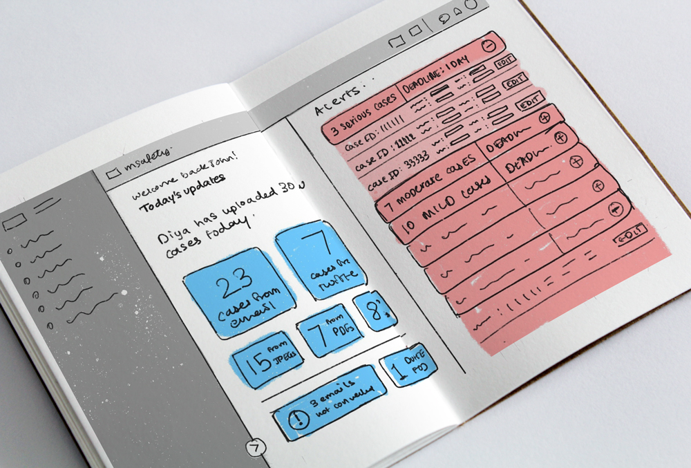

Simplifying the first screen user experience
The dashboard was designed to be easy to read and contain only essential information. This information varied according to different roles and was also designed to be customizable. We used basic principles of colour psychology to colour code different information according to importance.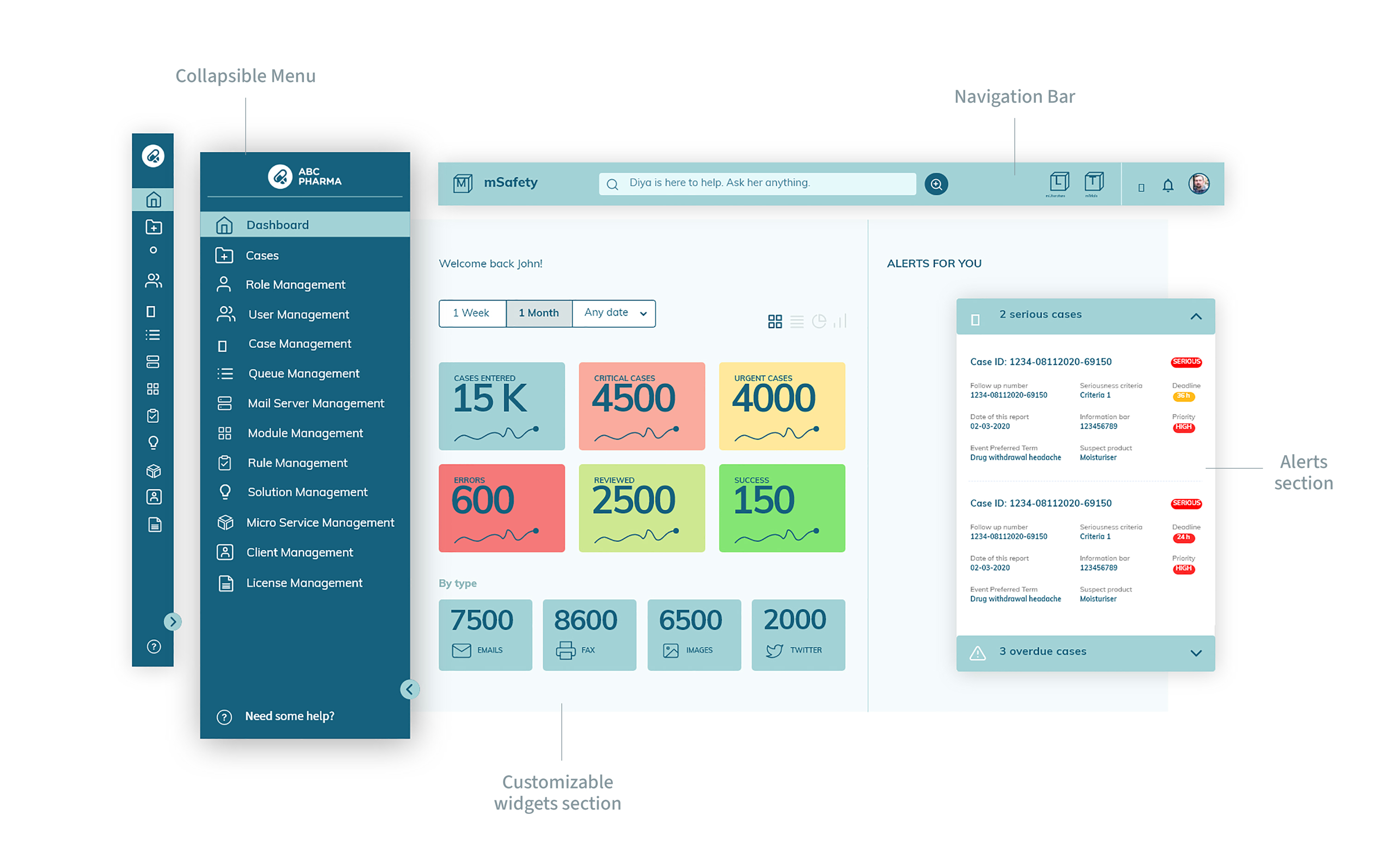
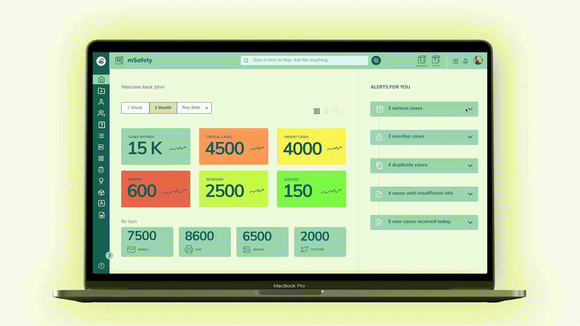
A walkthrough of the dashboard screens.
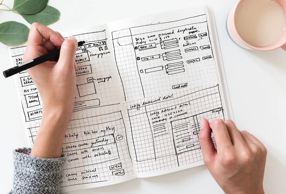
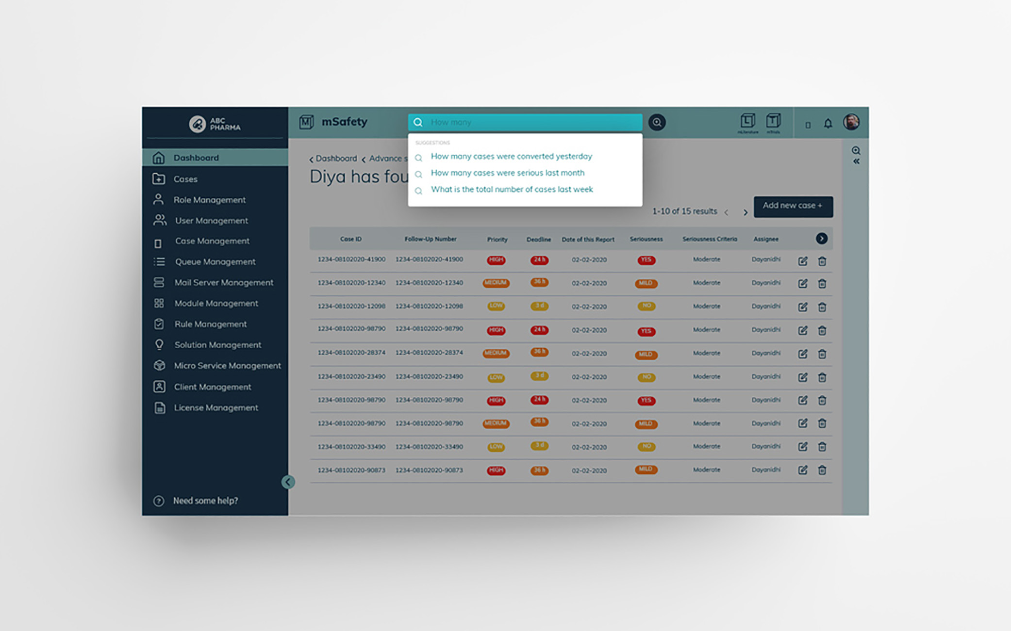
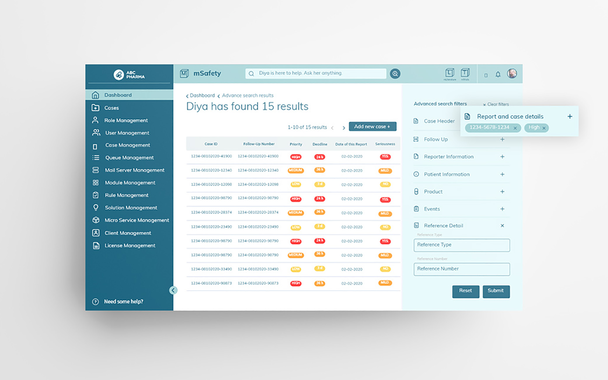
AI-powered search
Diya is mSafety’s AI-powered search engine. This feature helps navigate easily through multiple cases and numerous data sheets just by using keywords or phrases. There were two kinds of search flows - Suggested Search and Advanced Search. An accordion style UI design was created for the advanced search screen to showcase the multitude of filters that the user could select from.
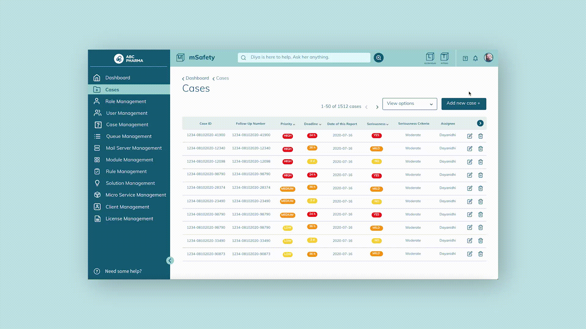
Case input and management
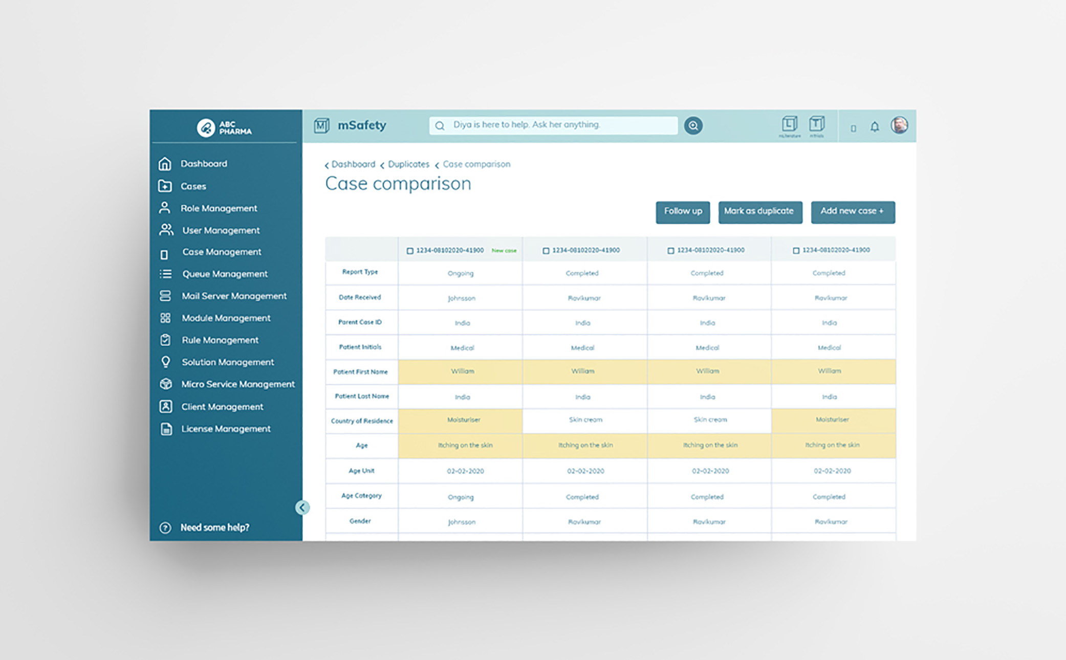
We created the three different flows needed for adding a case as well as various view options and filters for the user to be able to view the cases via priority, deadline, date of report, seriousness and so on.A thorough duplicate verification and comparison check flow was created since this was a common problem faced by users in safety management.

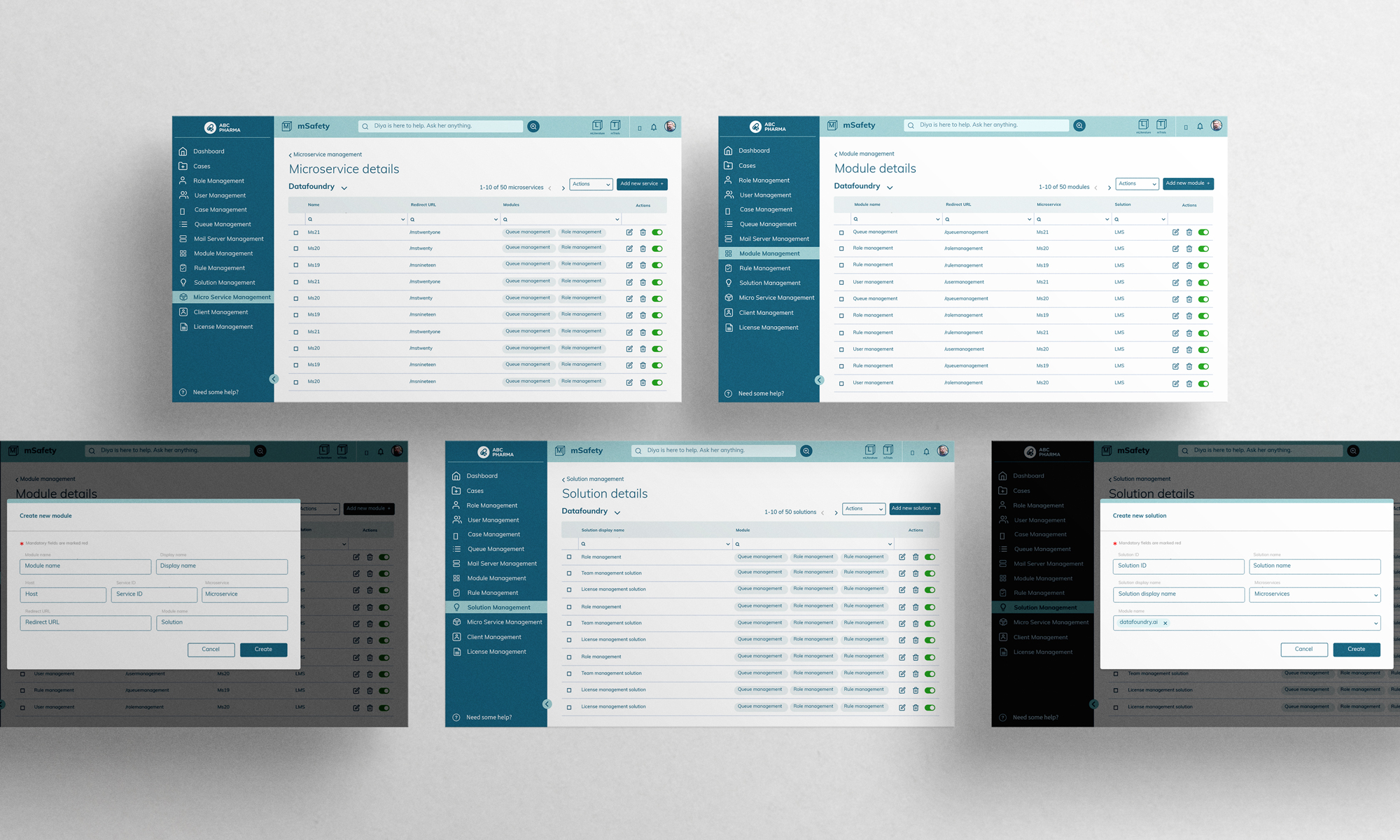
Admin screens
The client admin backend had features such as queue management, role management, rule management. The backend interface facilitated the management of different users and the kind of access they had.