Airaa brand identity
Design Challenge
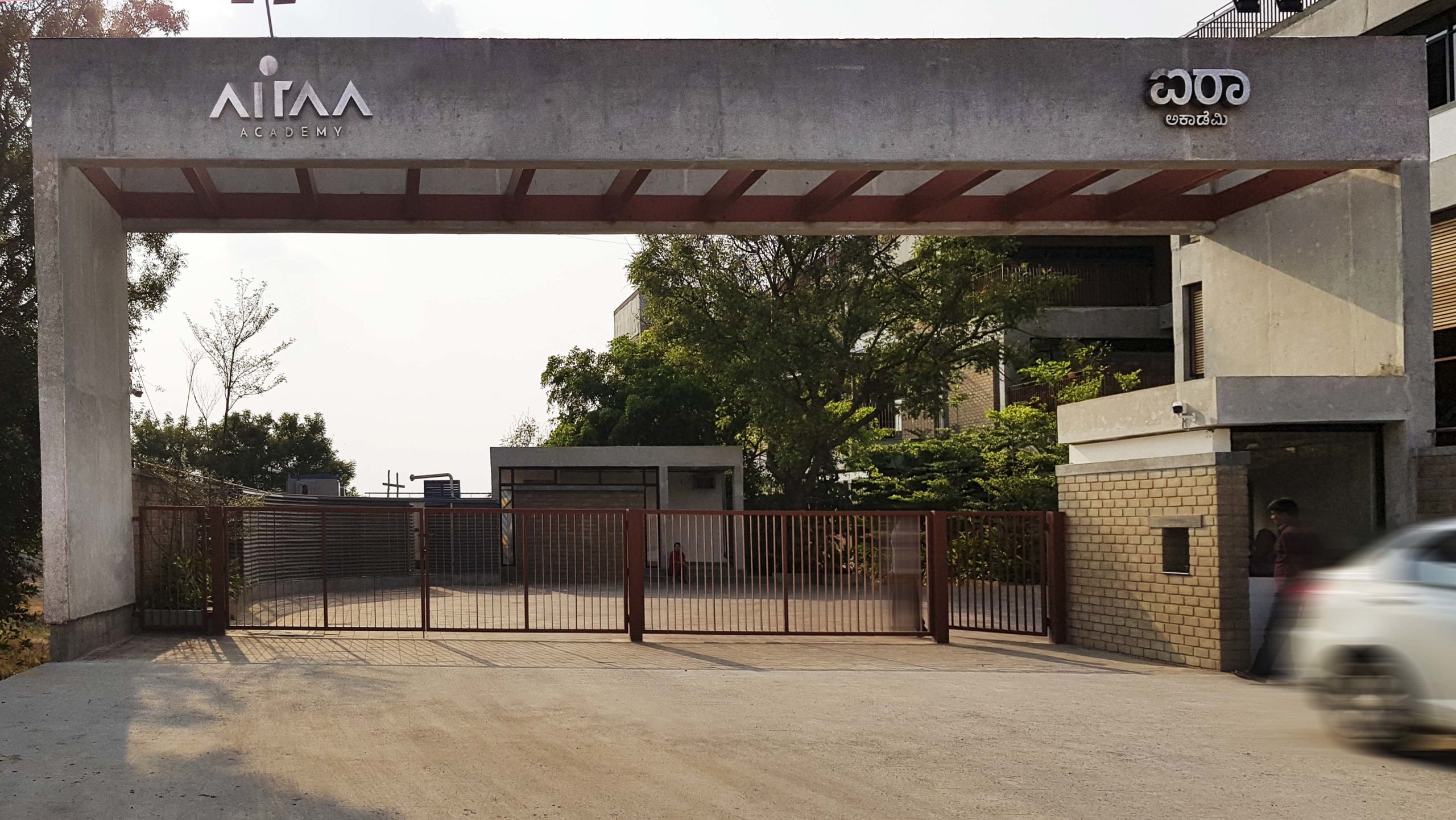
Airaa Academy, started by Amitha Prashanth, is a revolutionary Montessori school in Bangalore. Their Montessori method of teaching creates better decision-makers and leaders of children. The school had a beautiful new campus that was designed keeping sustainability at the forefront. Airaa needed a new brand identity and it had to be inspirational.
Solution
The dream that was Airaa was formed in Amitha’s mind many decades ago. Her first endeavour, the much sought after pre-school Prayag, led her and her school to impact many young minds and develop a bond unlike any with parents and students alike.
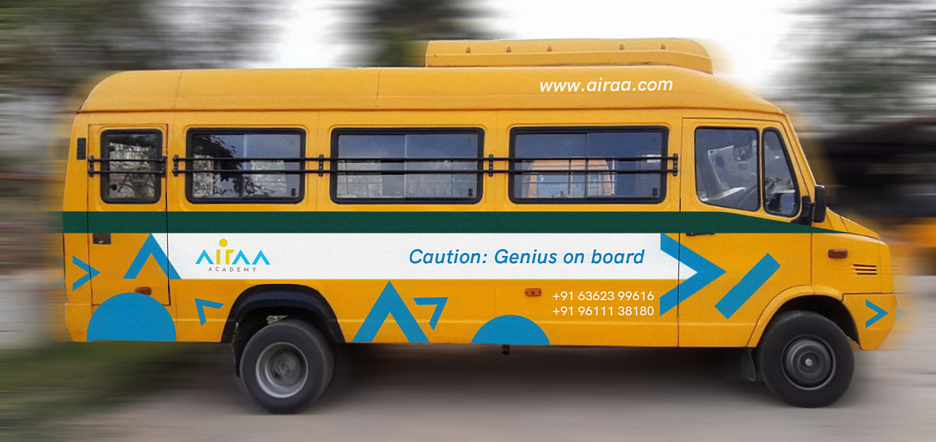
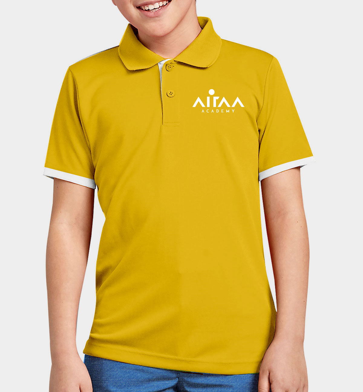
Thus the team spent a lot of time on the school campus, understanding the teaching methodologies, interacting with children and teachers, sitting in on classes and conducting workshops with parents to get their perspective. Along with the brand identity, the team designed around 30 unique brand applications including print & digital materials.
Airaa Academy, started by Amitha Prashanth, is a revolutionary Montessori school in Bangalore. Their Montessori method of teaching creates better decision-makers and leaders of children. The school had a beautiful new campus that was designed keeping sustainability at the forefront. Airaa needed a new brand identity and it had to be inspirational.
Solution
The dream that was Airaa was formed in Amitha’s mind many decades ago. Her first endeavour, the much sought after pre-school Prayag, led her and her school to impact many young minds and develop a bond unlike any with parents and students alike.
Thus the team spent a lot of time on the school campus, understanding the teaching methodologies, interacting with children and teachers, sitting in on classes and conducting workshops with parents to get their perspective. Along with the brand identity, the team designed around 30 unique brand applications including print & digital materials.
Role ︎︎︎ Creative lead, designer
Type of work ︎︎︎ Brand identity design
Studio ︎︎︎ Rezonant Design
Team ︎︎︎ MP Hariharan, Pranav Mathur, Tashita Mukherjee, Prathamesh Pagedar, Pallavi Das, Ajeesh M
Published ︎︎︎ 2020
Type of work ︎︎︎ Brand identity design
Studio ︎︎︎ Rezonant Design
Team ︎︎︎ MP Hariharan, Pranav Mathur, Tashita Mukherjee, Prathamesh Pagedar, Pallavi Das, Ajeesh M
Published ︎︎︎ 2020
Airaa - The Growth Path
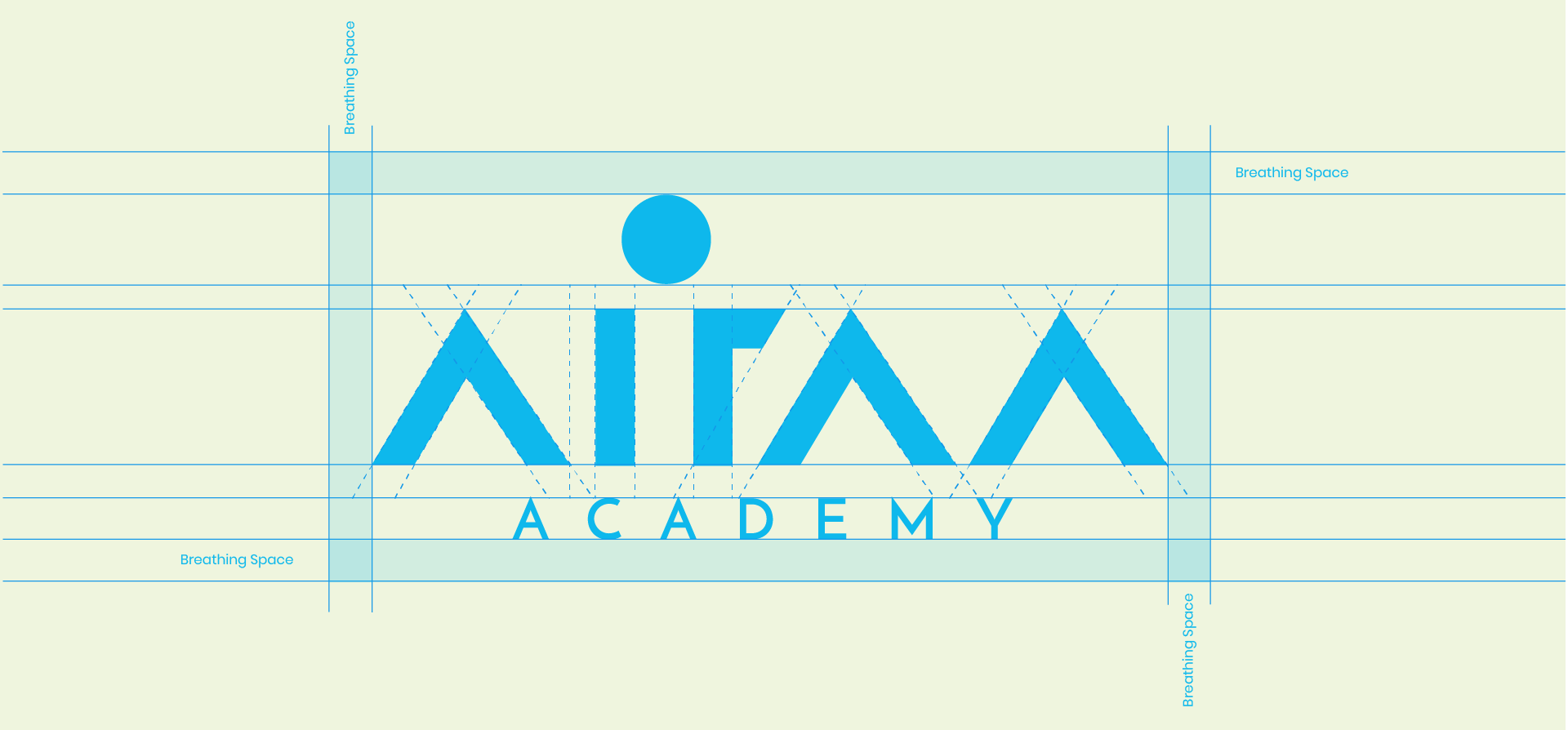
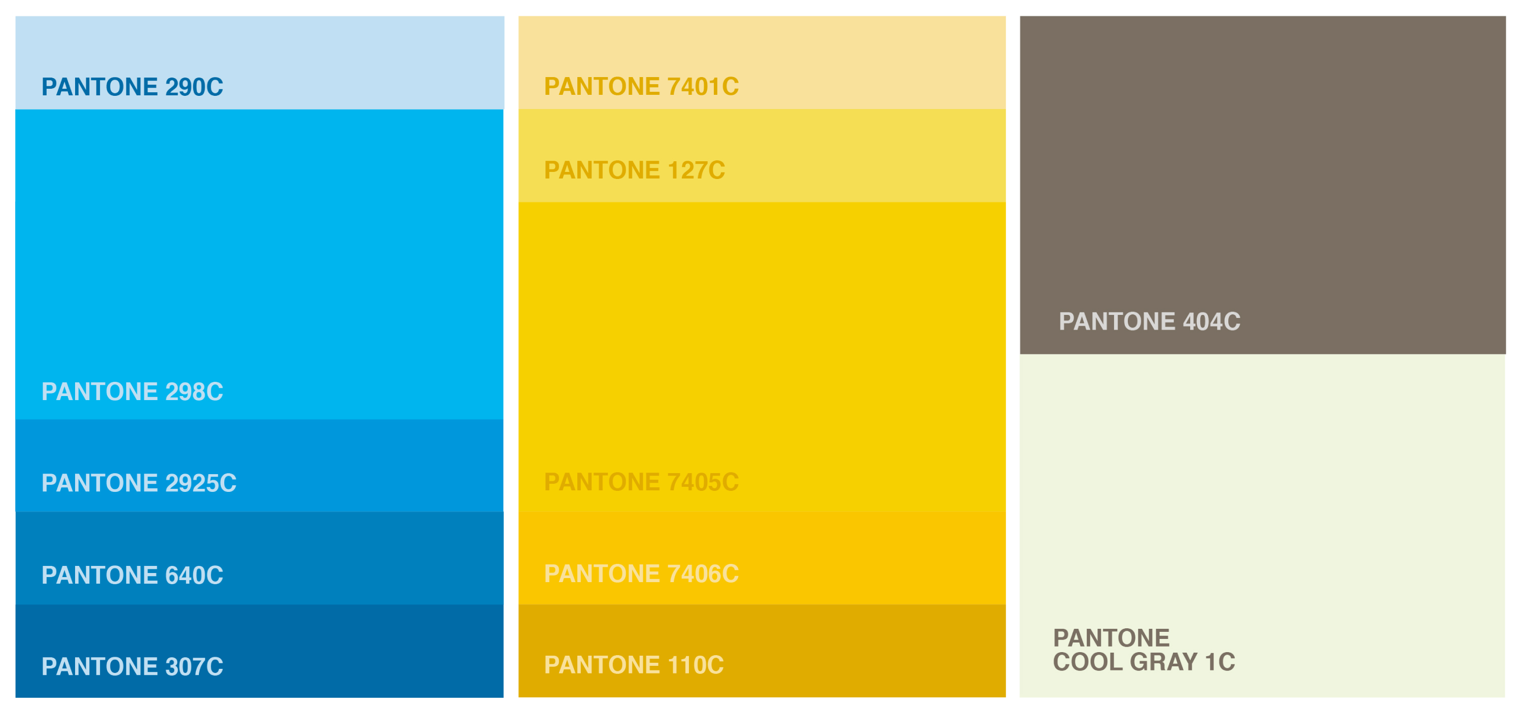
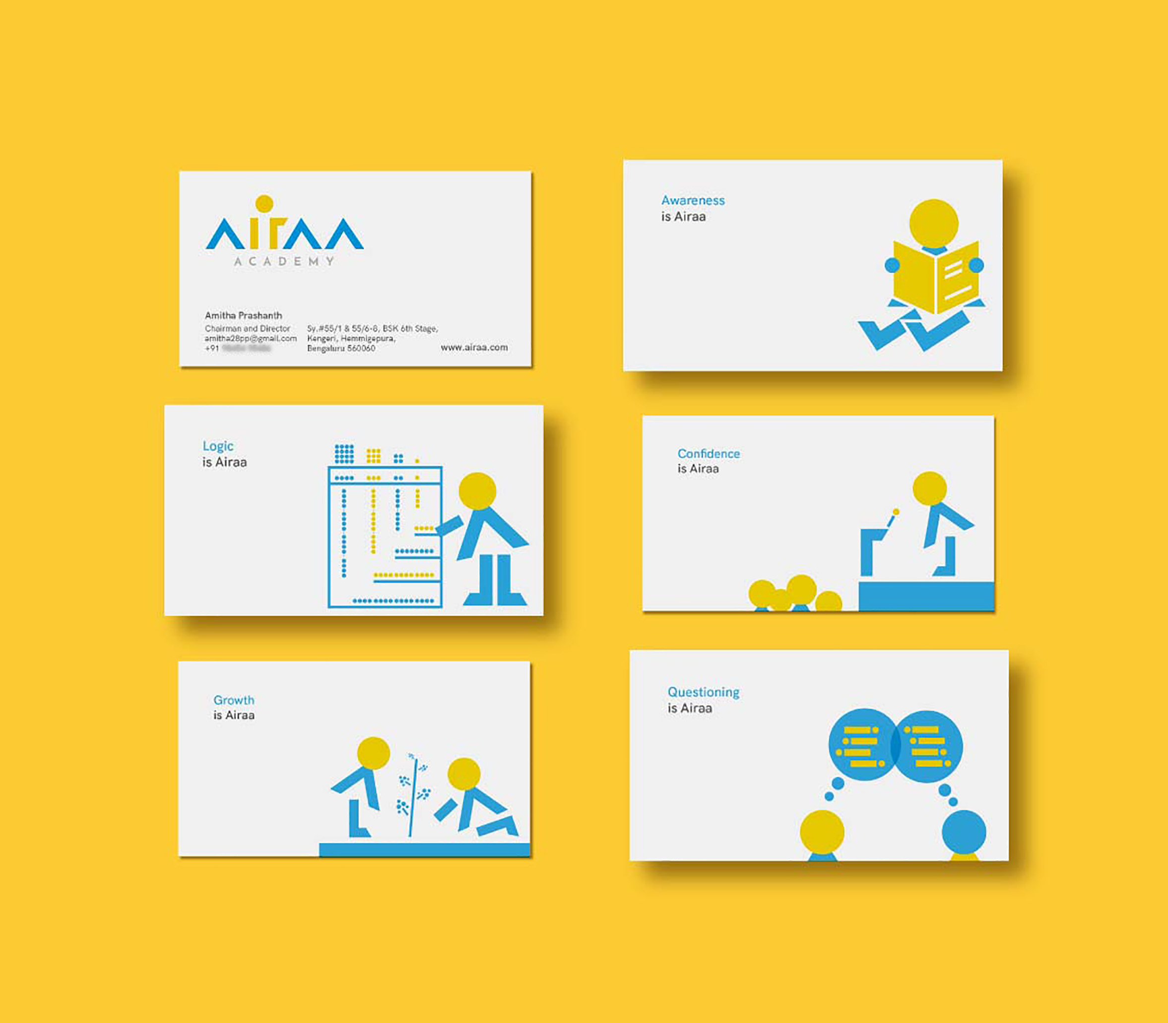
The brand identity followed Airaa’s simple principle of helping every child achieve his or her true potential. The logomark has 3 upward facing arrows that symbolize growth and the hidden child created between letters ‘i’ and ‘r’ is pointing towards that path - a path of growth. The 3 As in the logo stand for - Attitude, Aptitude, Aspiration.The colour palette selected was bright and cheerful; yellow stood for the energy that mirrored the students’ own and blue stood for the calm and soothing presence of the teachers. A clean and no-frills sans serif - HK Grotesque - was chosen as the typeface for the identity.

Brand assets
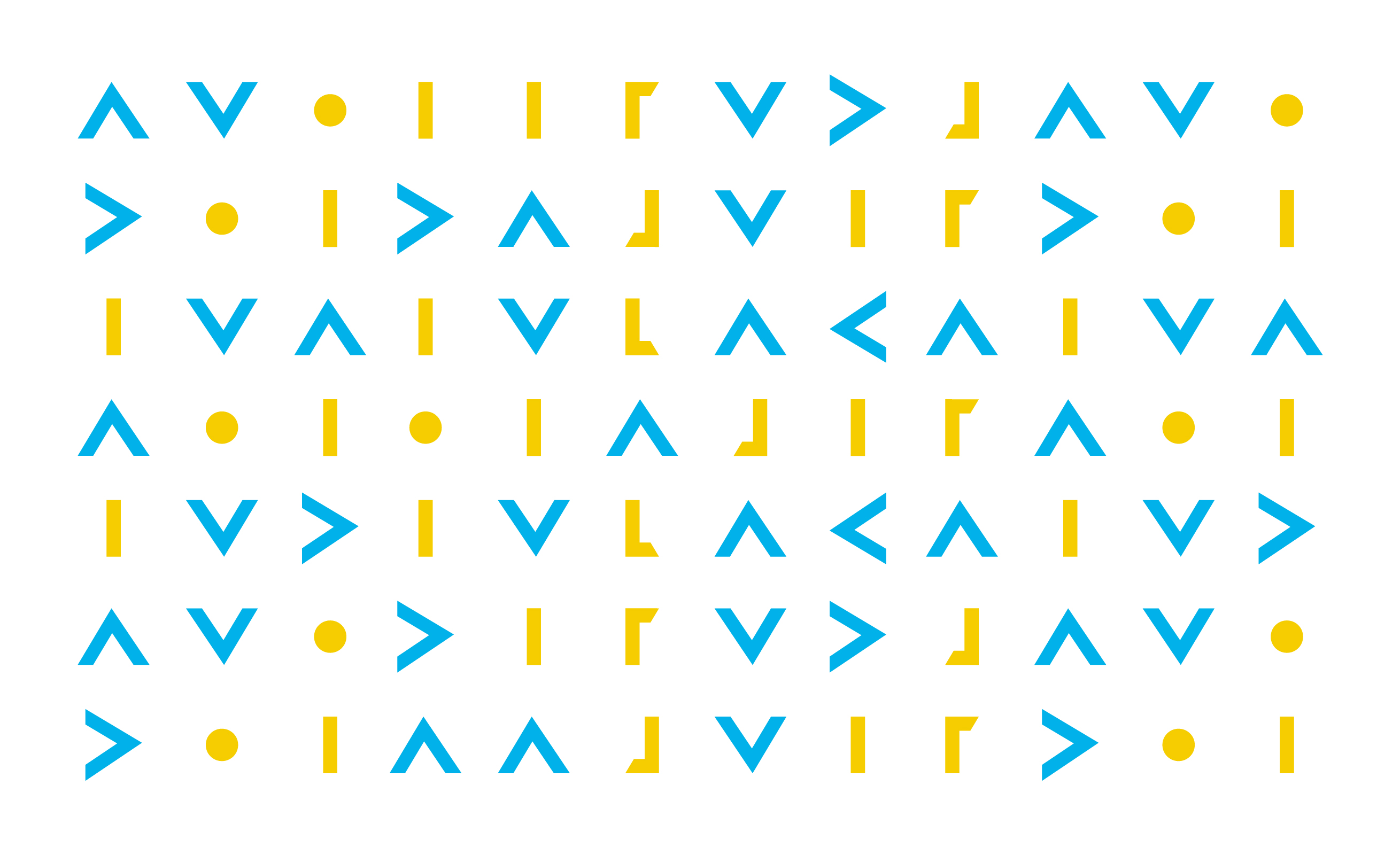
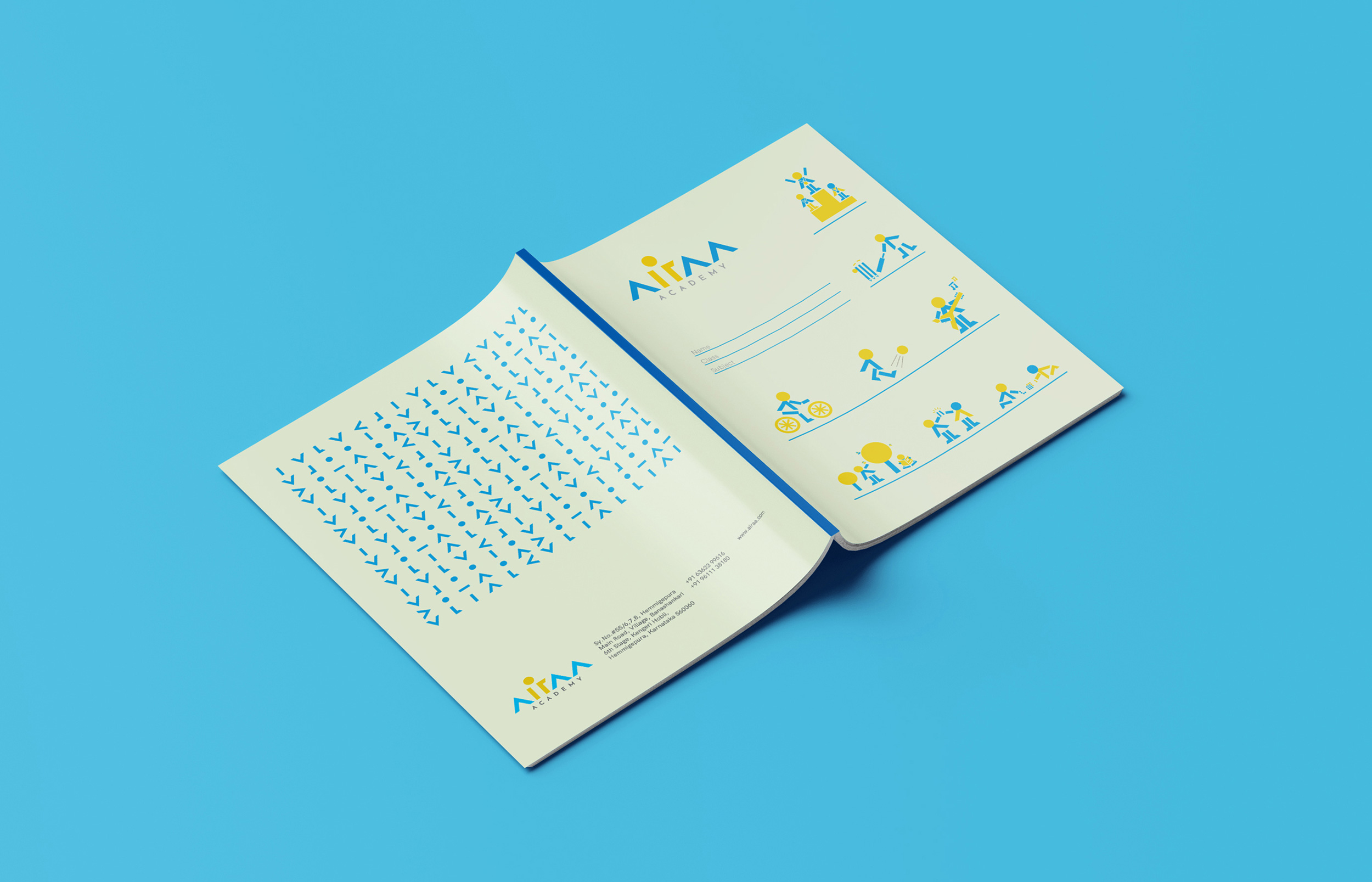
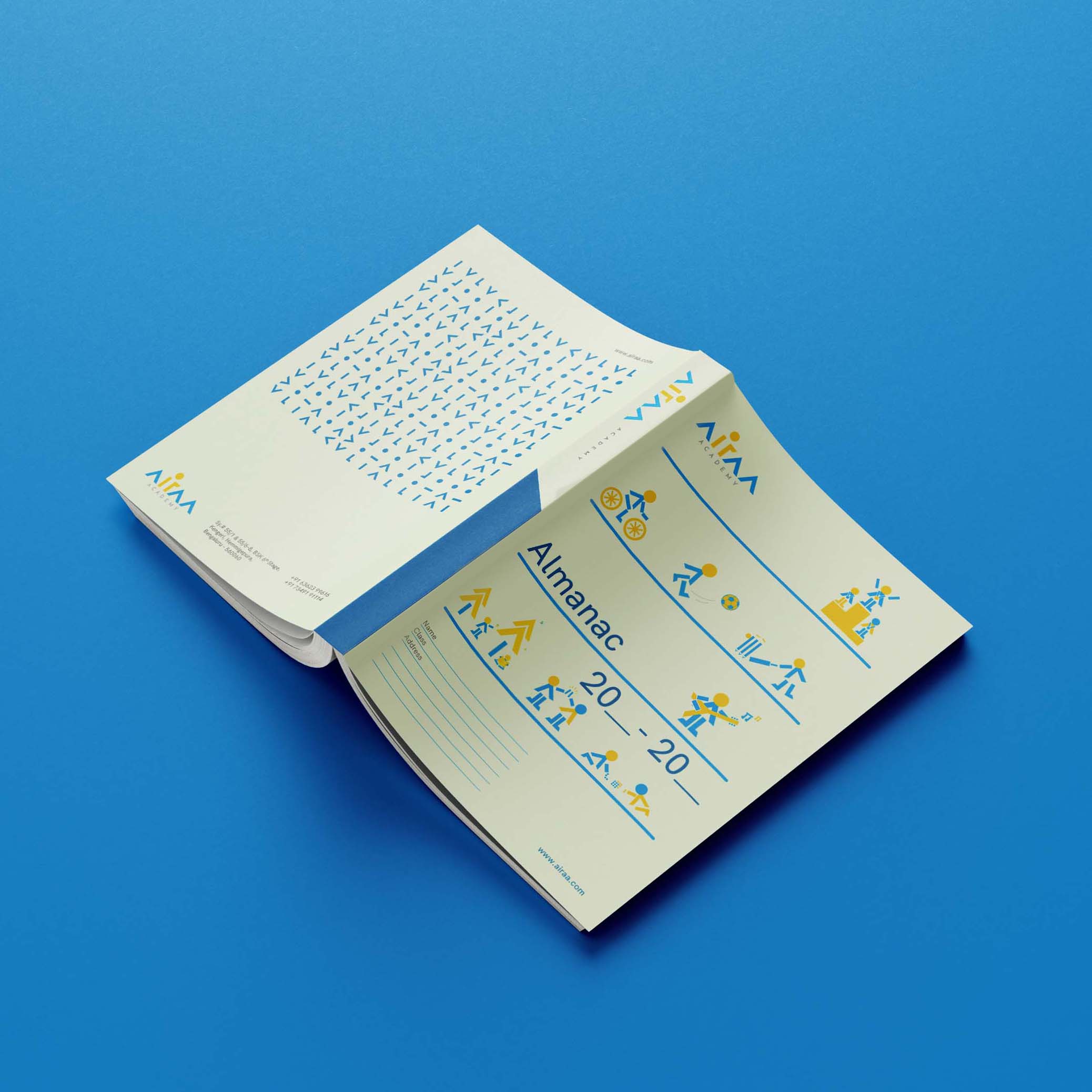
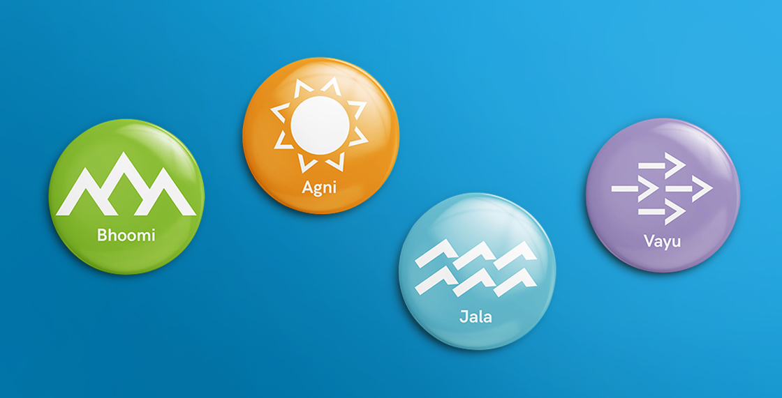
The team created a visual language from the simple shapes that make up the logo. Much like Lego blocks, these shapes are used to craft brand identity extensions for Airaa. The shapes represent growth (arrows), the child (head), the foundation (pillars) and the turn (L-shape).
Illustrations were created from these basic shapes to form visuals that represented different facets of life at Airaa - like unique learning methologies, sports & music activities, friendship, care for environment and animals, friendship and mentorship and freedom of expression.


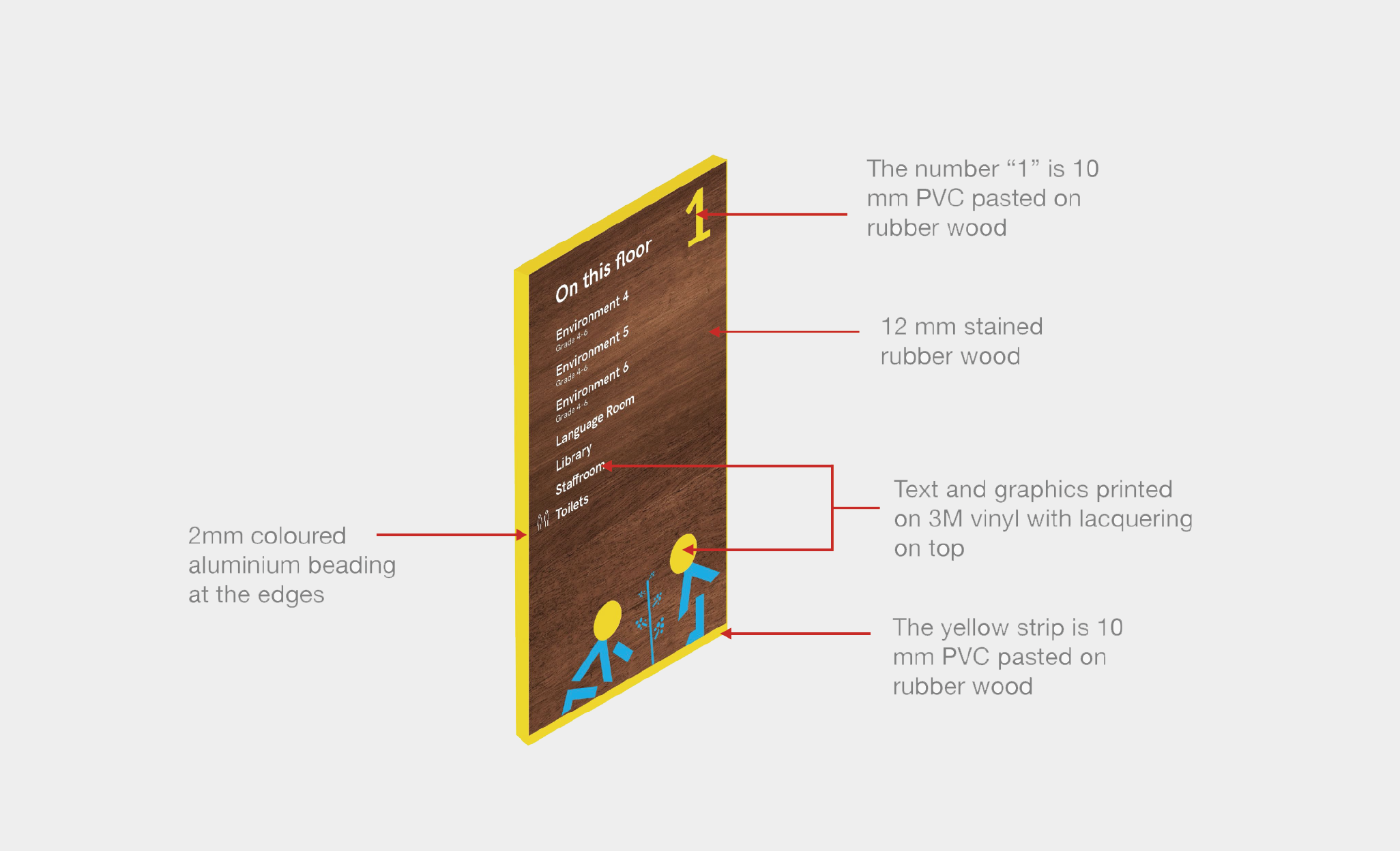
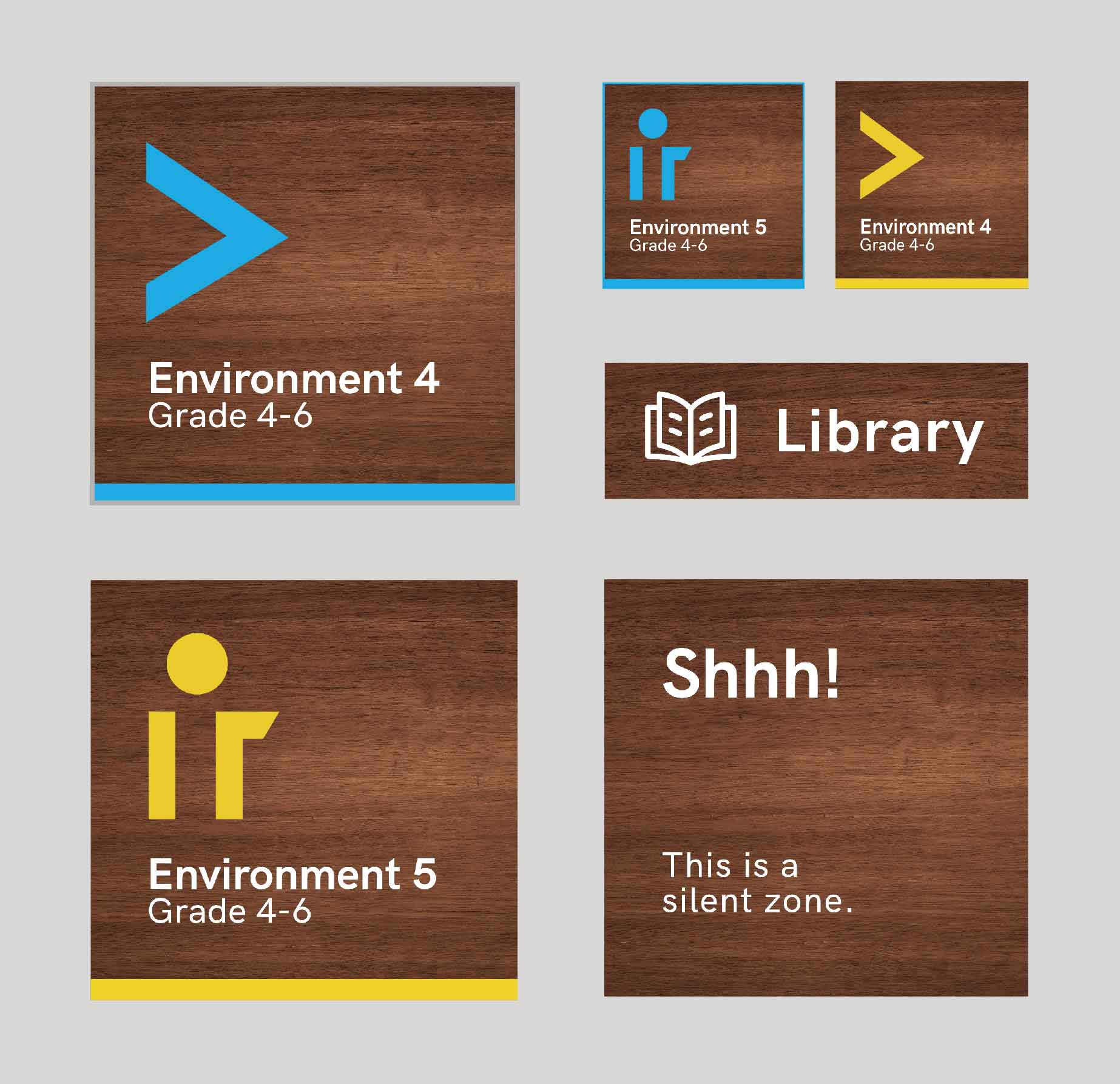
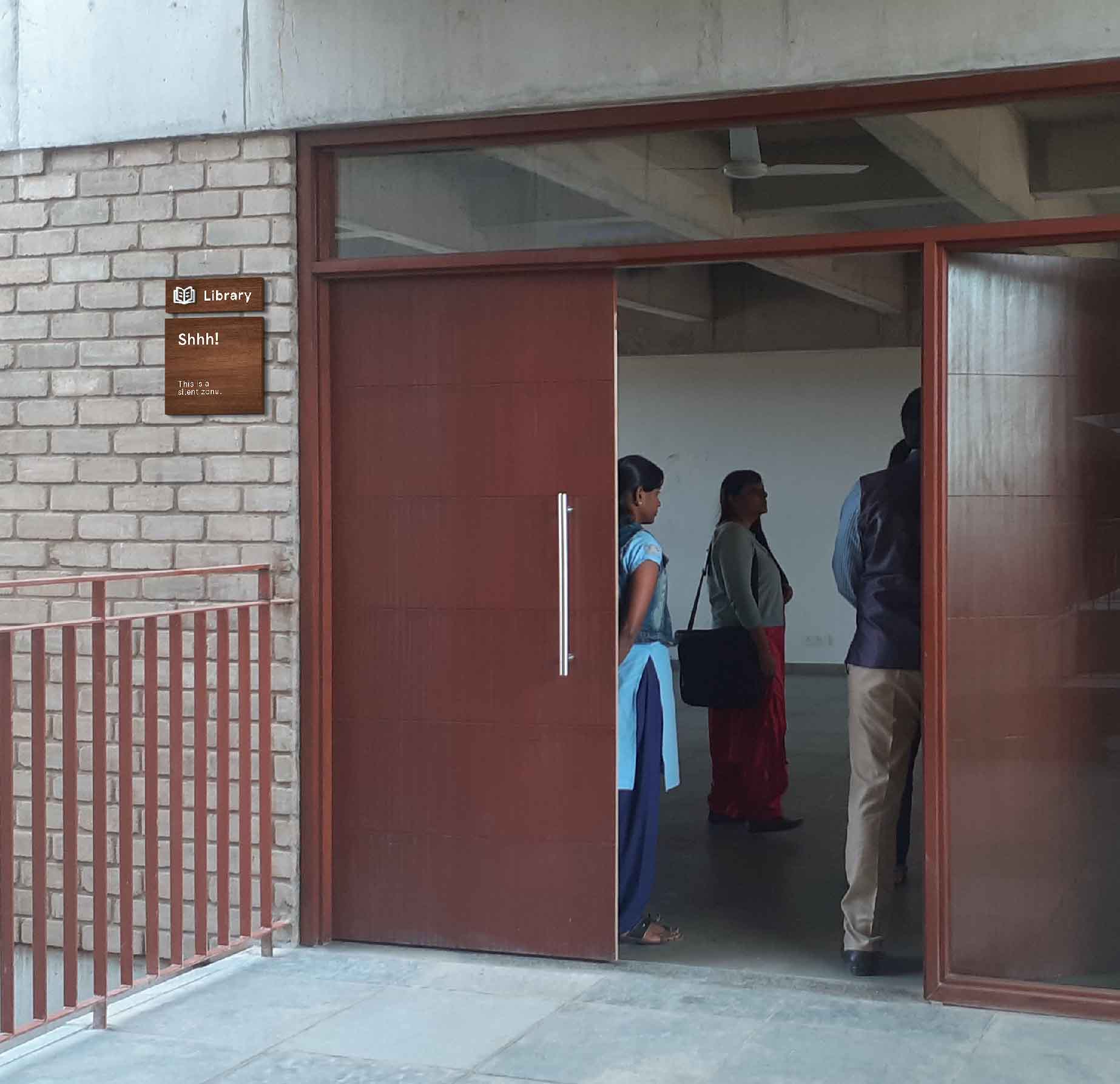
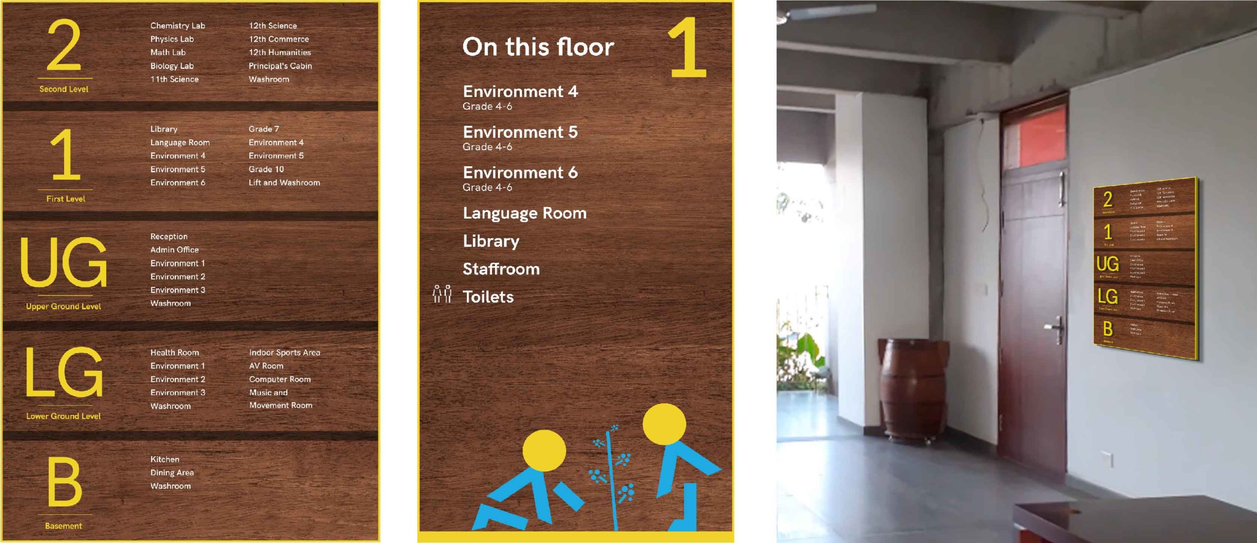
School signage
The school signage and wayfinding design was simple and classy. The team designed signages that would compliment the beautiful school interiors. The signages had a stained rubberwood base with a yellow aluminium beading around it and printed graphics on top of it.
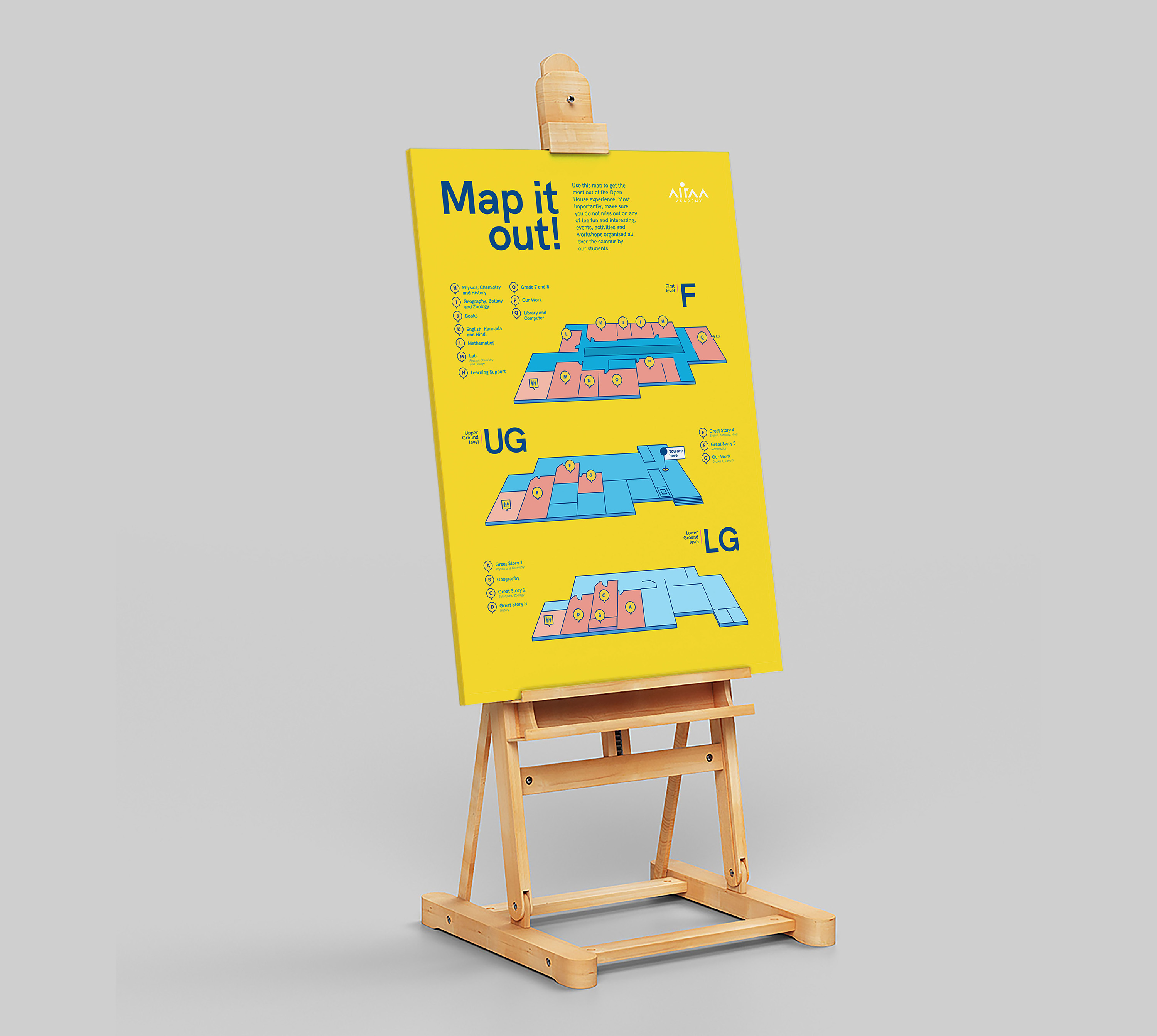
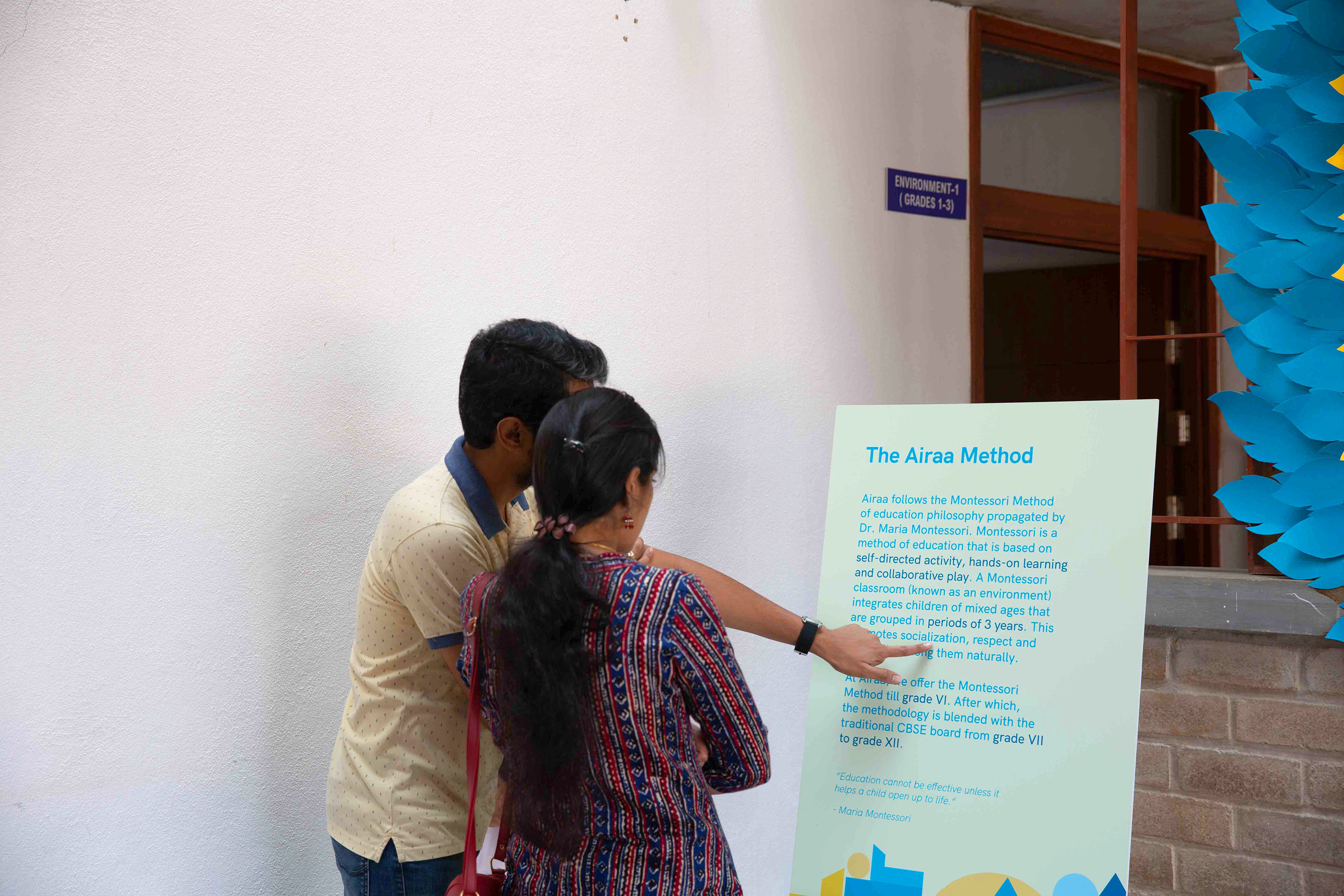
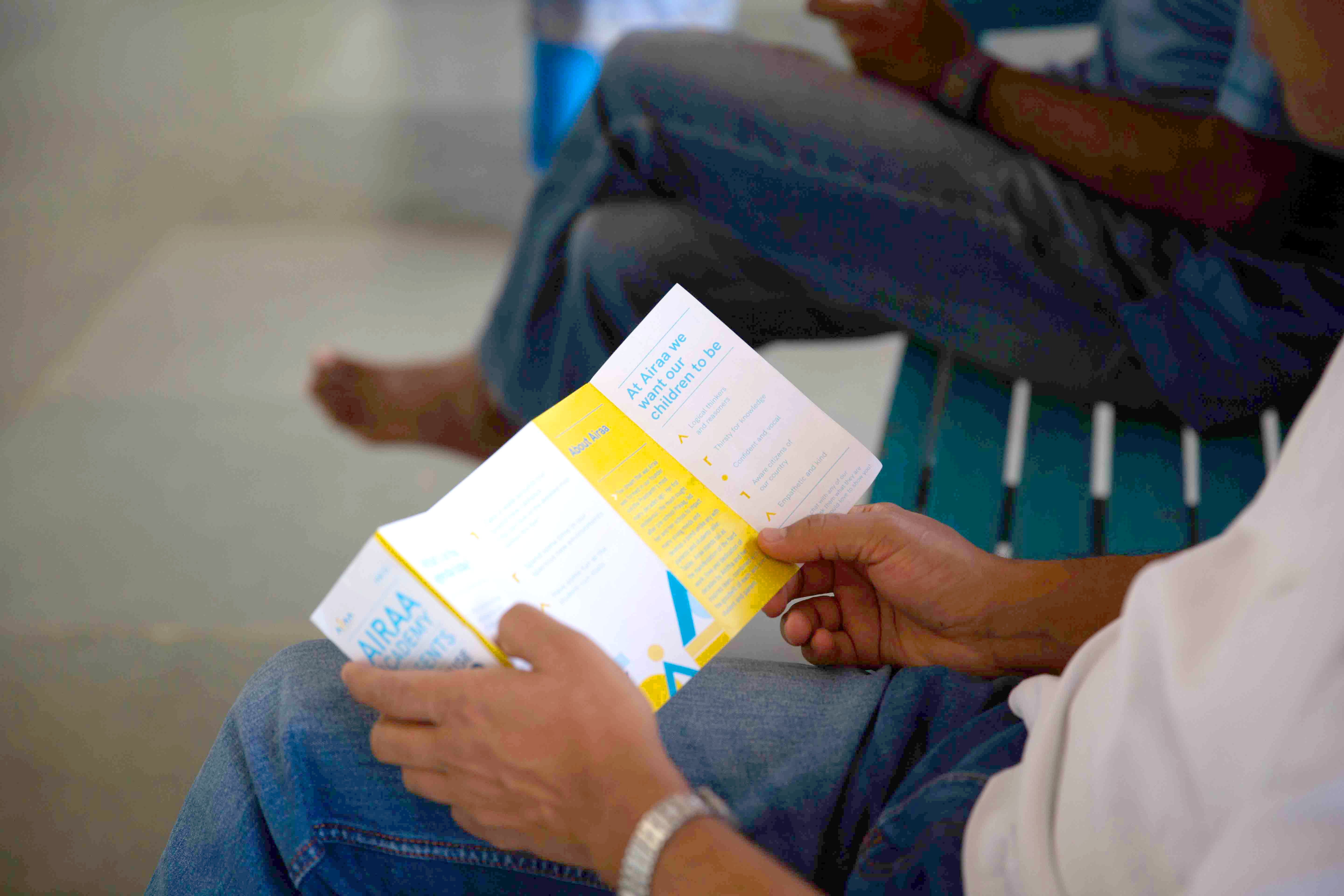
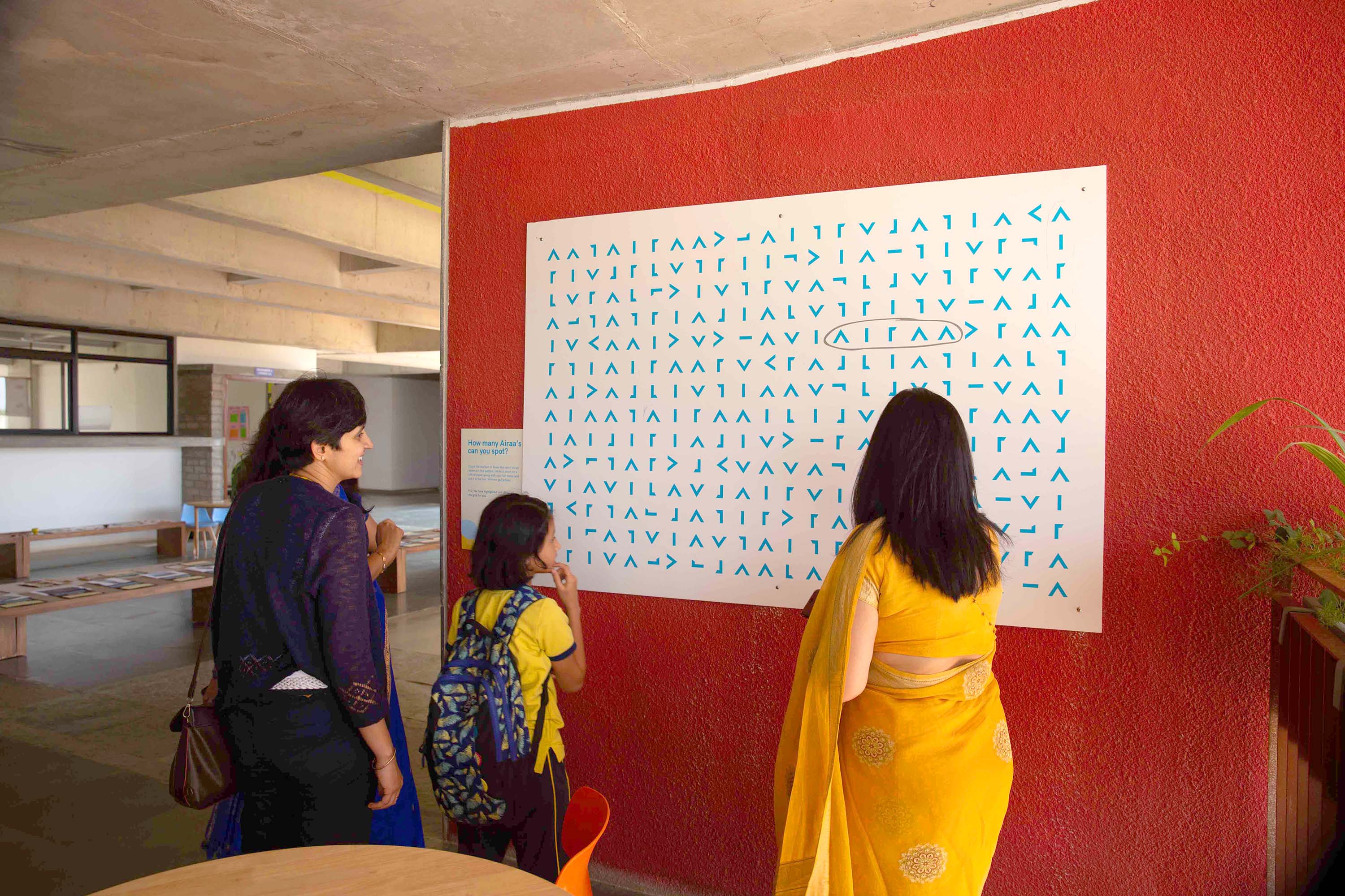
Airaa Open House
Airaa holds an ‘Open House’ event every year for the students to showcase their projects as well as for potential students and their parents to visit the school to learn more about it. The team designed communication material for Open House 2020 such as information easels, temporary signages, leaflets and few interactive games.